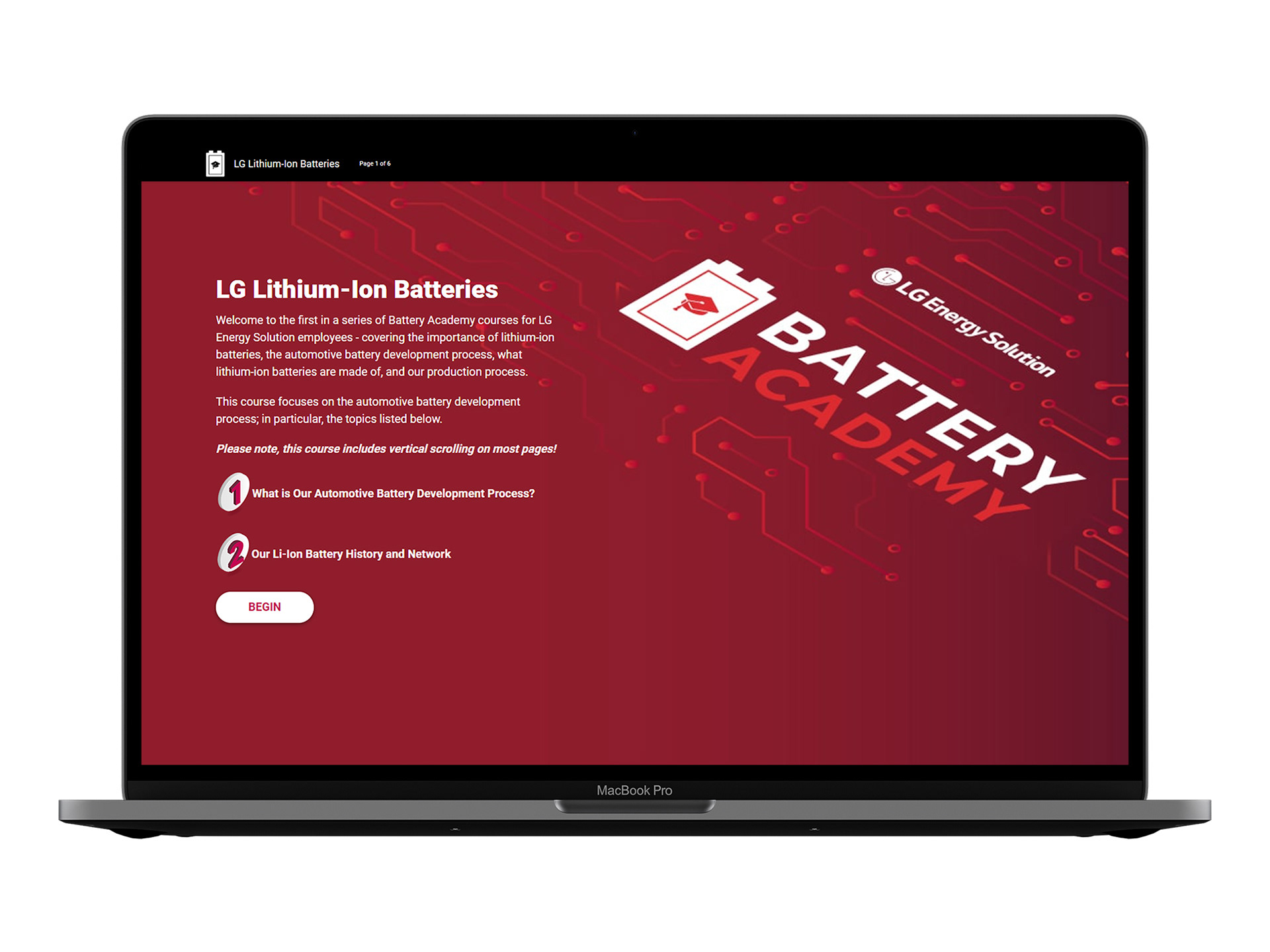
BATTERY ACADEMY LOGO
This logo was designed to go with the Battery Academy eLearning I designed (see my UI/UX page) for LG.
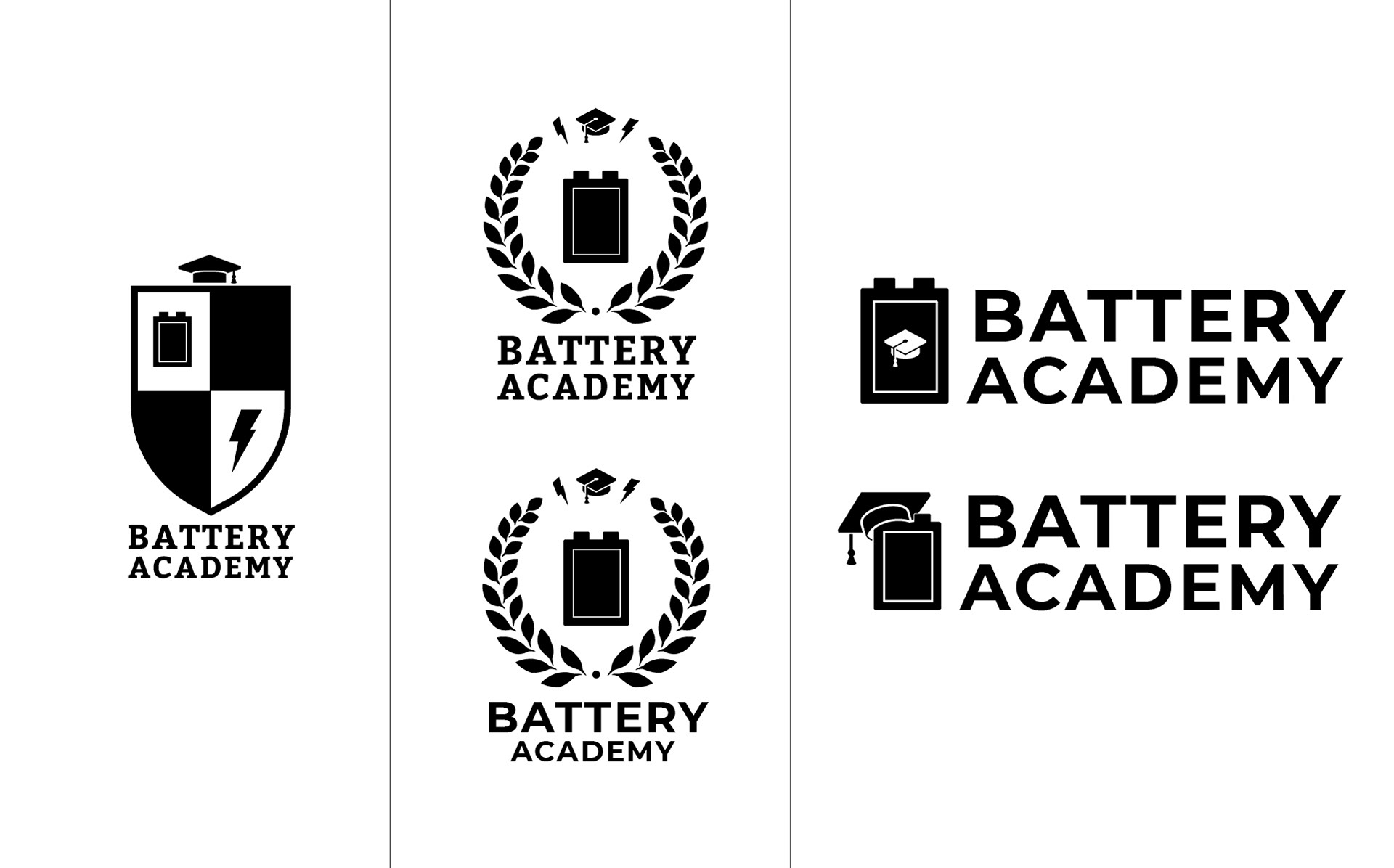
Initial Concepts
In my first round of digital sketches I leaned heavily on the academic emblem idea, trying to combine different symbols that were relevant to what the eLearning would be about, and especially working to make LG's battery shape a main part of that logo.
Color Exploration
After narrowing down a few concepts and finalizing fonts, I introduced color into the logos to see how LG's brand red color would work in my designs.
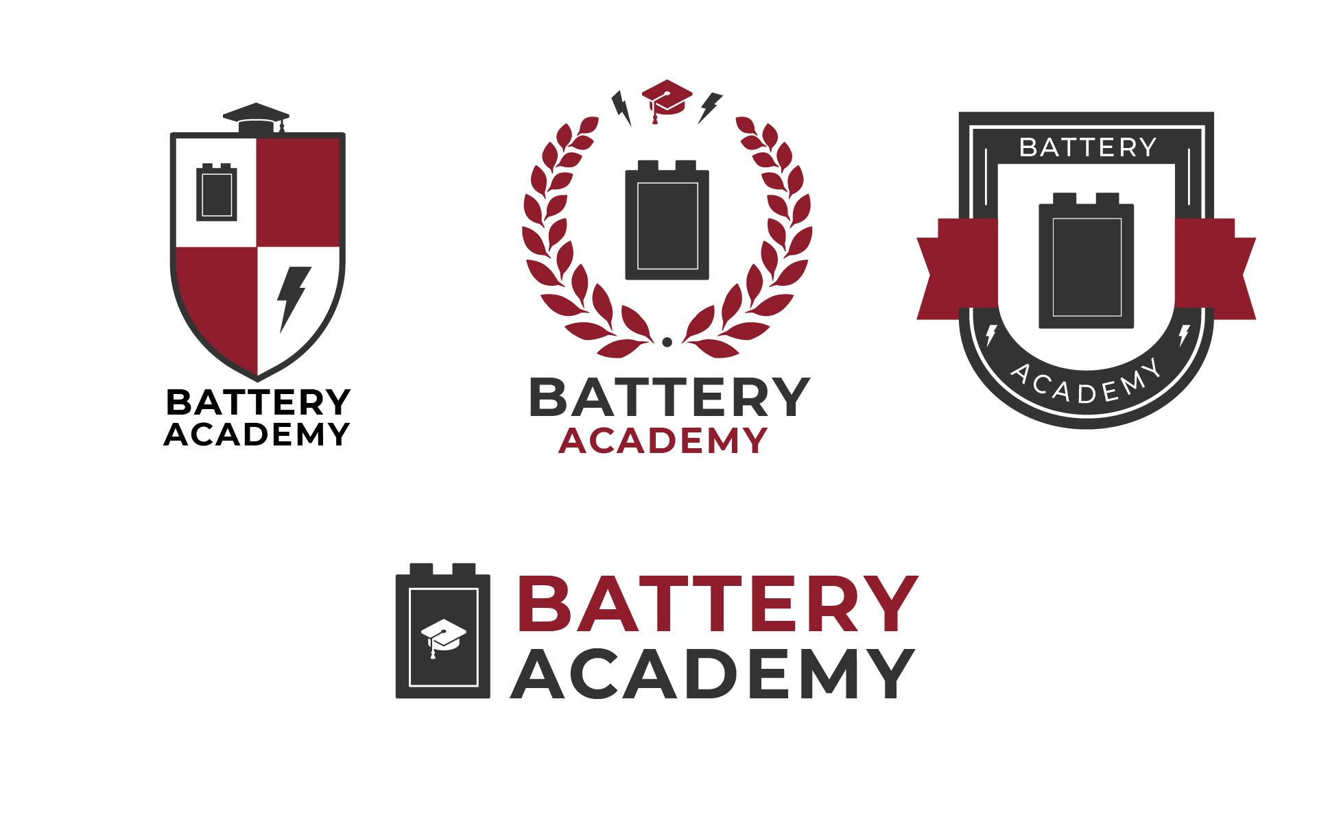
The Final Result
In the end, we decided on the most minimal of the logos for the eLearning's brand. While the ideas of academic emblems were fun to explore, ultimately the use cases for this logo were going to be mostly shown in it's smallest form in the navigation bar of the eLearnings, so we needed something that translated well to a smaller size. And the minimal logo definitely fit that need, while still showcasing LG's battery design.