Scientific Modeling Tool
for Classrooms
for Classrooms
How do you design an intuitive tool for building models when even the teachers don't know how to model?
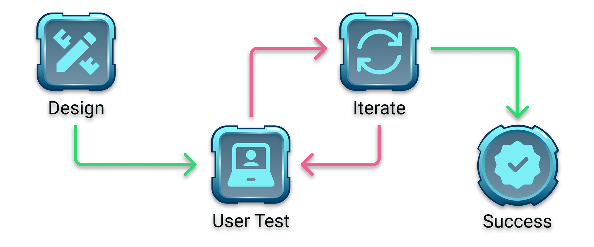
I designed an interactive model builder for science students who had never built a model before. The biggest challenge wasn't the interface. It was that modeling itself is so interpretive and unfamiliar that even the teachers couldn't consistently explain what we were asking students to build. The tool had to work flexibly across biology, chemistry, physics, and environmental science while providing enough structure to guide solution-focused thinking.
I designed an interactive model builder for science students who had never built a model before. The biggest challenge wasn't the interface. It was that modeling itself is so interpretive and unfamiliar that even the teachers couldn't consistently explain what we were asking students to build. The tool had to work flexibly across biology, chemistry, physics, and environmental science while providing enough structure to guide solution-focused thinking.
Project Snapshot

Role: UI/UX Designer
• Led user research, strategy, interaction design, visual design, and post-launch validation.
• Collaborated directly with PM/pedagogical expert and engineering.
• Created design system patterns now used across product line.
• Collaborated directly with PM/pedagogical expert and engineering.
• Created design system patterns now used across product line.

Timeline: 1 month (design, testing, iteration, design spec delivery)

Team: Product Manager (former science teacher, pedagogical expert), 1 Developer/Engineer

Scope: Reusable interaction component for STEM Cases (linear, problem-based online science courses)

Outcome: Launched in 4 STEM Cases, used by 60,000+ students in 2024 school year. Now being adapted for a 5th case and has become the template for simplified modeling tools in other courses.
The Challenge
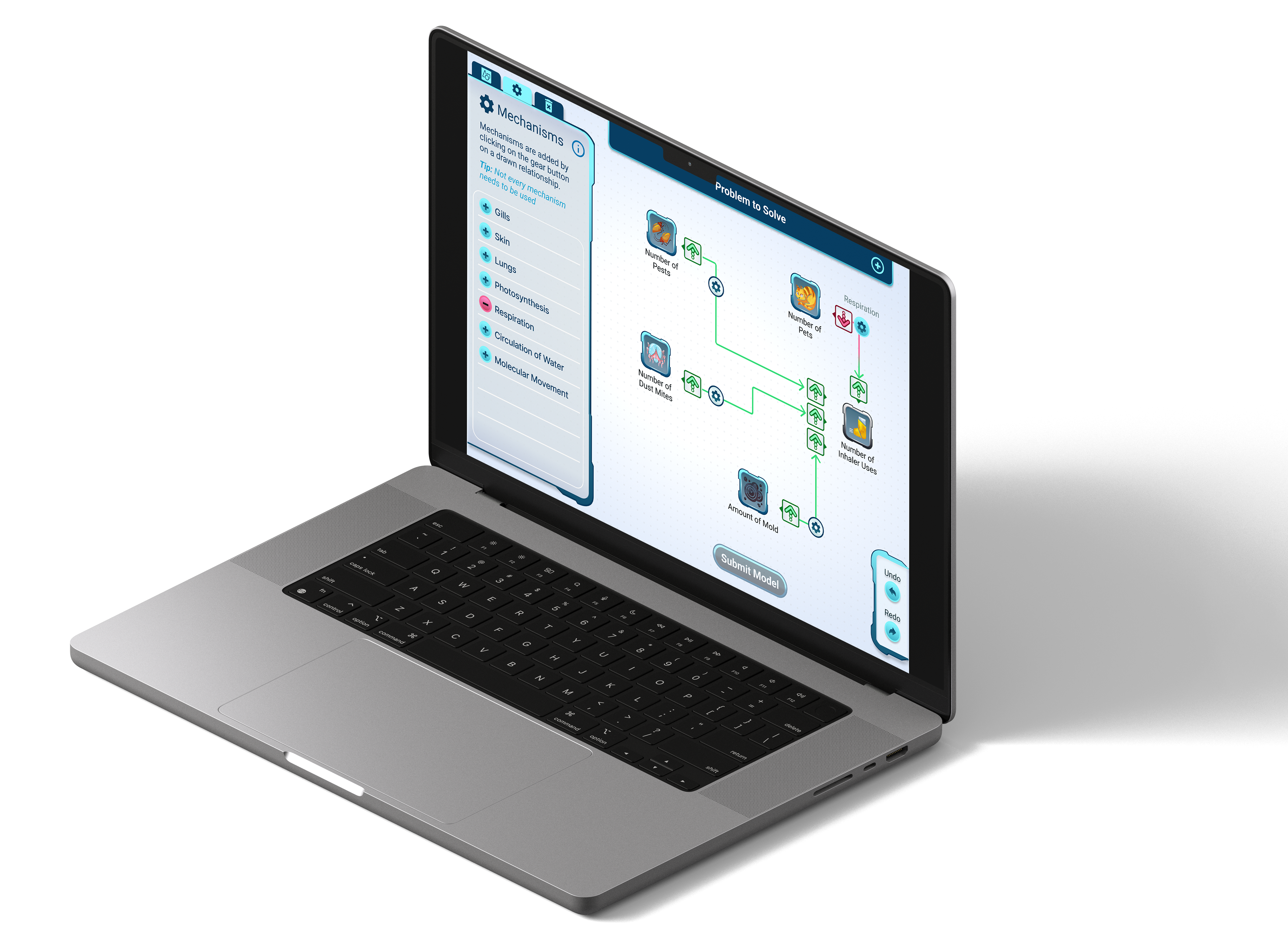
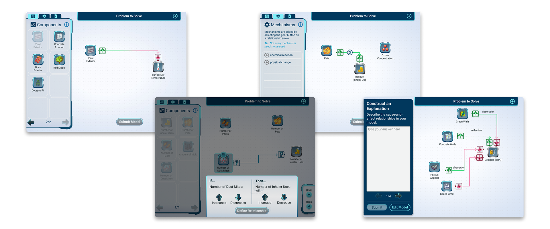
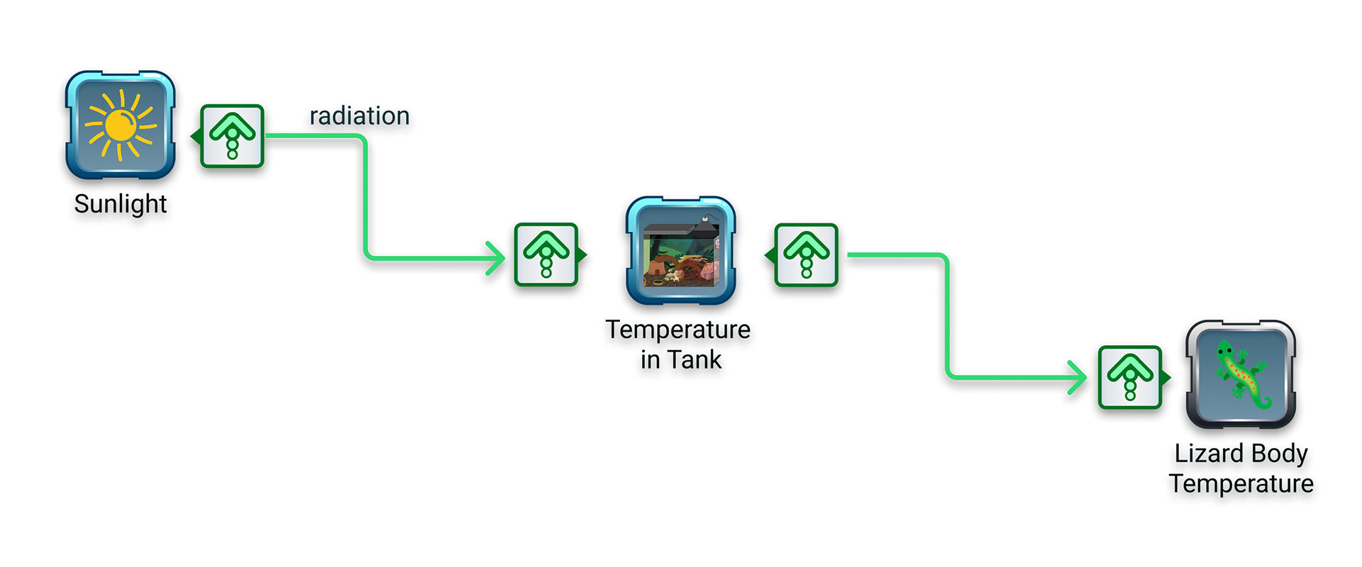
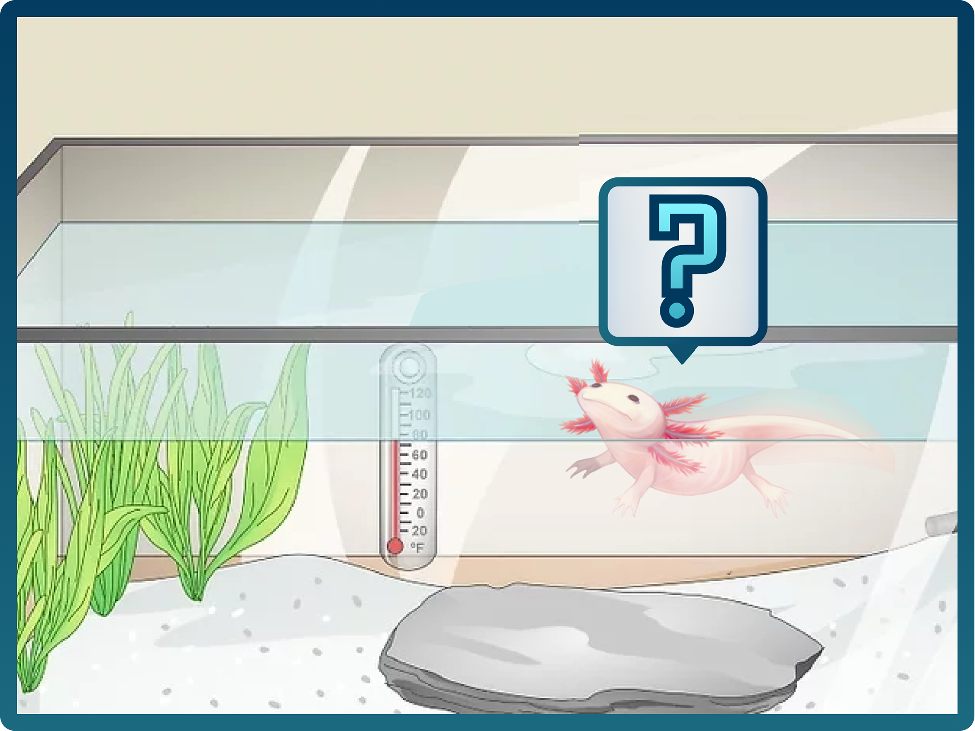
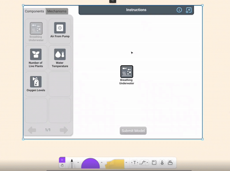
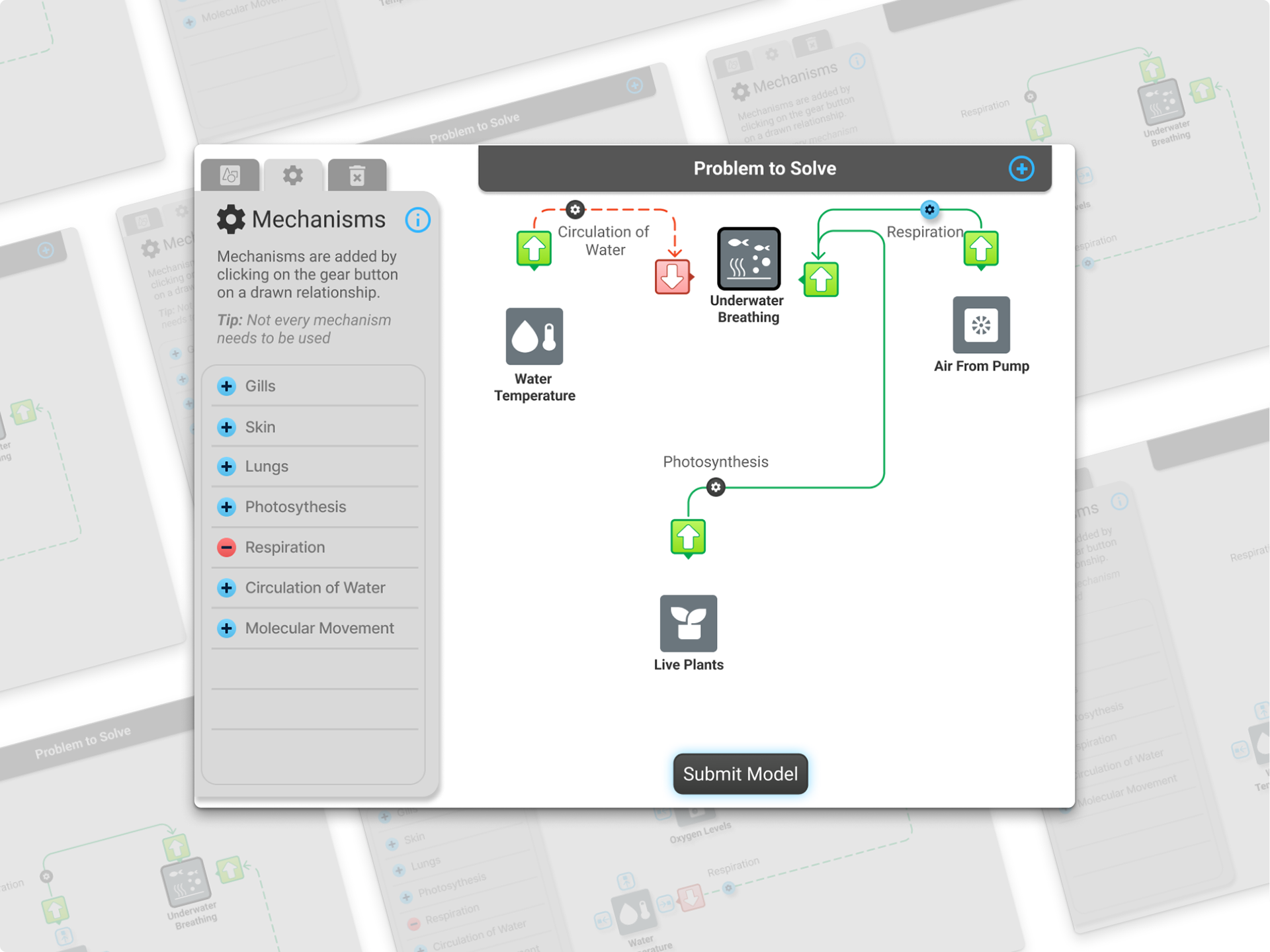
The brief seemed straightforward: design an interaction where students build models to solve real-world science problems. For example, increasing oxygen levels in a pet axolotl's tank by connecting components like live plants, air pump, and water temperature through cause-and-effect relationships.
The brief seemed straightforward: design an interaction where students build models to solve real-world science problems. For example, increasing oxygen levels in a pet axolotl's tank by connecting components like live plants, air pump, and water temperature through cause-and-effect relationships.
But models are inherently interpretive. Multiple teachers in our testing told us that modeling is "open to interpretation." The same problem can be modeled in vastly different ways depending on what you're trying to show. Teachers emphasized that models are "deliberate simplifications" where you intentionally leave out steps, and that visual models always need written explanations to be fully understood.

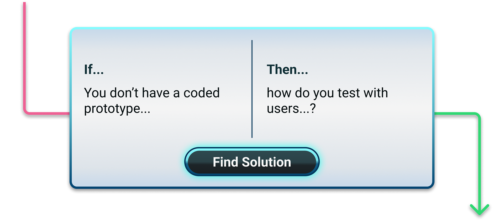
This meant I had to pull double duty: teach users what modeling is while teaching them how to use the tool. User testing revealed that even teachers were unfamiliar with building scientific models, despite state engineering education standards requiring it. I also faced technical constraints (the developer could only output text summaries, not visual screenshots for grading) and pedagogical requirements (my PM needed mechanisms and if-then statements to support meaningful learning).
The real challenge: Design a flexible tool that works across all science disciplines, teaches the concept of modeling itself, and provides enough scaffolding to guide students toward building solutions rather than just recreating existing systems.
Research Innovation: Testing Without a Prototype
The Problem: I needed to validate the concept and design of this model-building interaction before our limited engineering team could commit to building it. But the model builder was too open-ended for a traditional Figma prototype. Users could build infinite variations of models, so I couldn't pre-build every possible state.
My Solution: I designed a Wizard of Oz testing method using FigJam. I built a component library with all model elements in multiple states: default, hover, selected, and connected. During live testing sessions, teachers would hover over what they wanted to interact with, and I'd update the canvas in real-time as they talked through their thinking. I'd apply hover effects, make poppers appear, draw relationship arrows, and add mechanisms by pulling components from my library. The process ran at dial-up speeds, but it worked.
Why This Worked: This approach gave me two advantages: First, I could test open-ended interactions without waiting for engineering resources. Second, I got real-time insight into how users thought through problems because I was literally drawing their mental models as they verbalized them. For Round 2, I built a traditional Figma prototype for the tutorial (linear, on-rails), but kept the Wizard of Oz method for the open-ended problem-solving portion.
Impact: My PM and colleagues praised this approach for letting us move fast without sacrificing insight quality. It became a testing template for how we evaluate other open-ended interactions in our product line.
Findings & Iteration
I led moderated remote testing with teachers across two rounds (8 total participants, varying grade levels from middle school to AP courses). I used think-aloud protocols and follow-up surveys to understand not just usability, but how they interpreted our problem scenarios and what they thought students should build. Through these rounds of user testing and feedback, I discovered three problems that needed fixing.
Problem 1: Onboarding
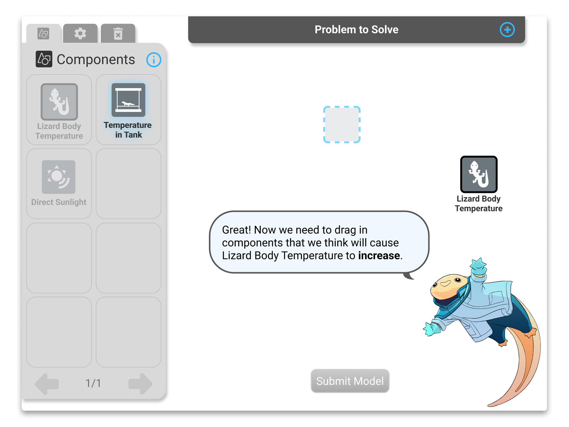
What failed: In Round 1 testing, teachers understood the UI mechanics but struggled to understand what to build. I presented them with a small block of instructions they could reference, but didn't have to engage with. They didn't retain the instructions, so they spent mental energy figuring out how to use the tool rather than solving the problem. Most thought they needed to describe the entire existing system instead of building a solution. One teacher spent 5 minutes agonizing over what to add to her two-component model, then gave up because she was overwhelmed.
The Change: I designed a step-by-step interactive tutorial using guided poppers that forced users to complete a simple model before attempting complex problems. Each step built on the last: drag components, draw a relationship, define it, and add a mechanism. This scaffolding taught users the context for solution modeling by having them build it themselves, rather than just reading about it. Passive instructions didn't teach the process; hands-on interaction did. The trade-off was adding onboarding time, which initially made the PM nervous. But Round 2 testing ended up validating this decision.
Validation: Teachers who completed the tutorial were significantly more confident and solution-focused. They described it as "helpful, gave me a sense of how to think about building solutions." Unlike Round 1's conceptual wandering, Round 2 testers moved purposefully through complex problems, building focused solution models rather than sprawling system descriptions.
Problem 2: Framing & Visual Context
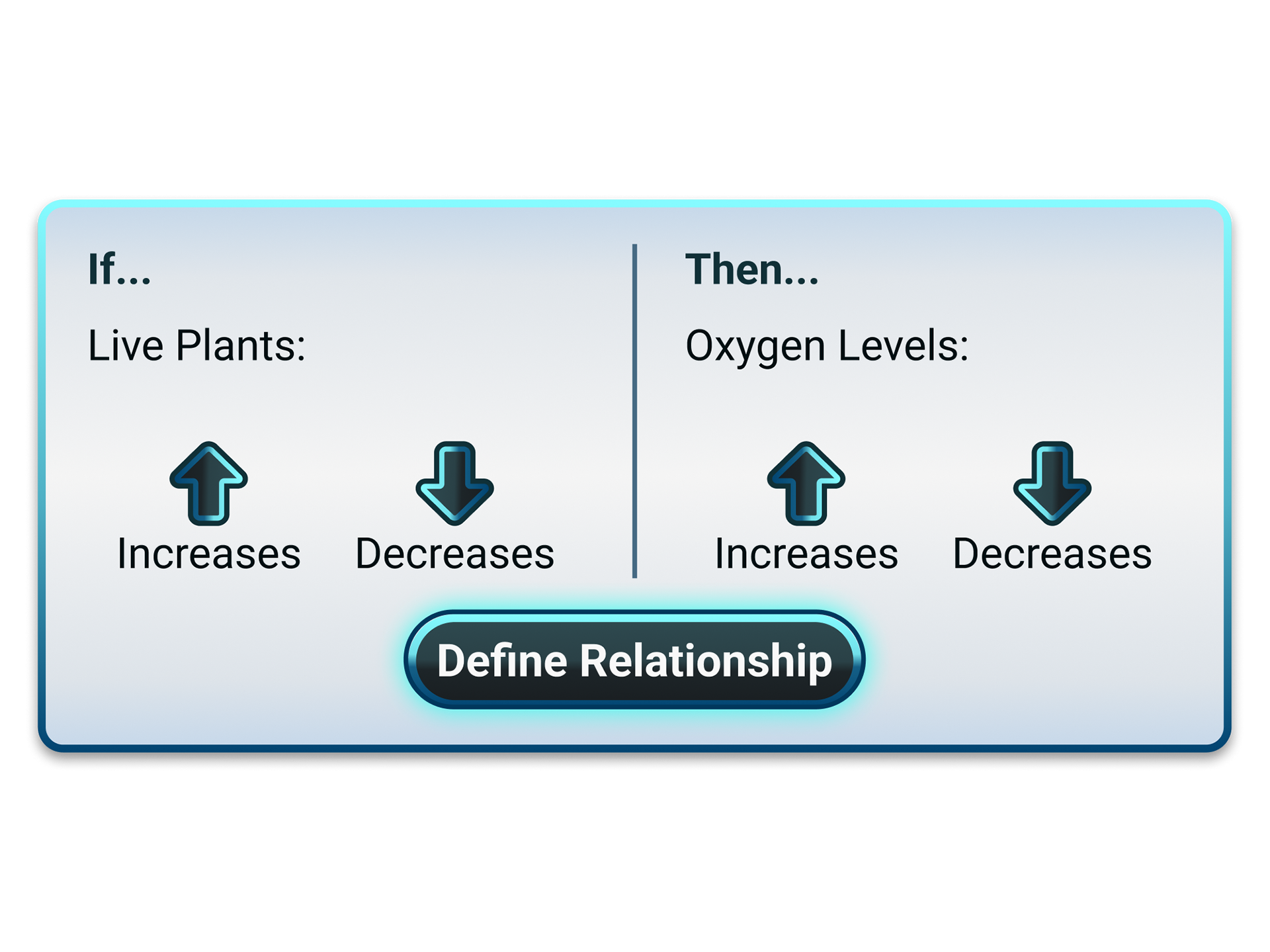
What failed: Teachers got caught up in the ambiguity of what "increasing" or "decreasing" components meant. Does increasing plants mean getting bigger plants, adding more of them, or getting different kinds of plants? Without clear problem framing or specific instructions, they modeled whatever seemed relevant rather than focusing on solutions.
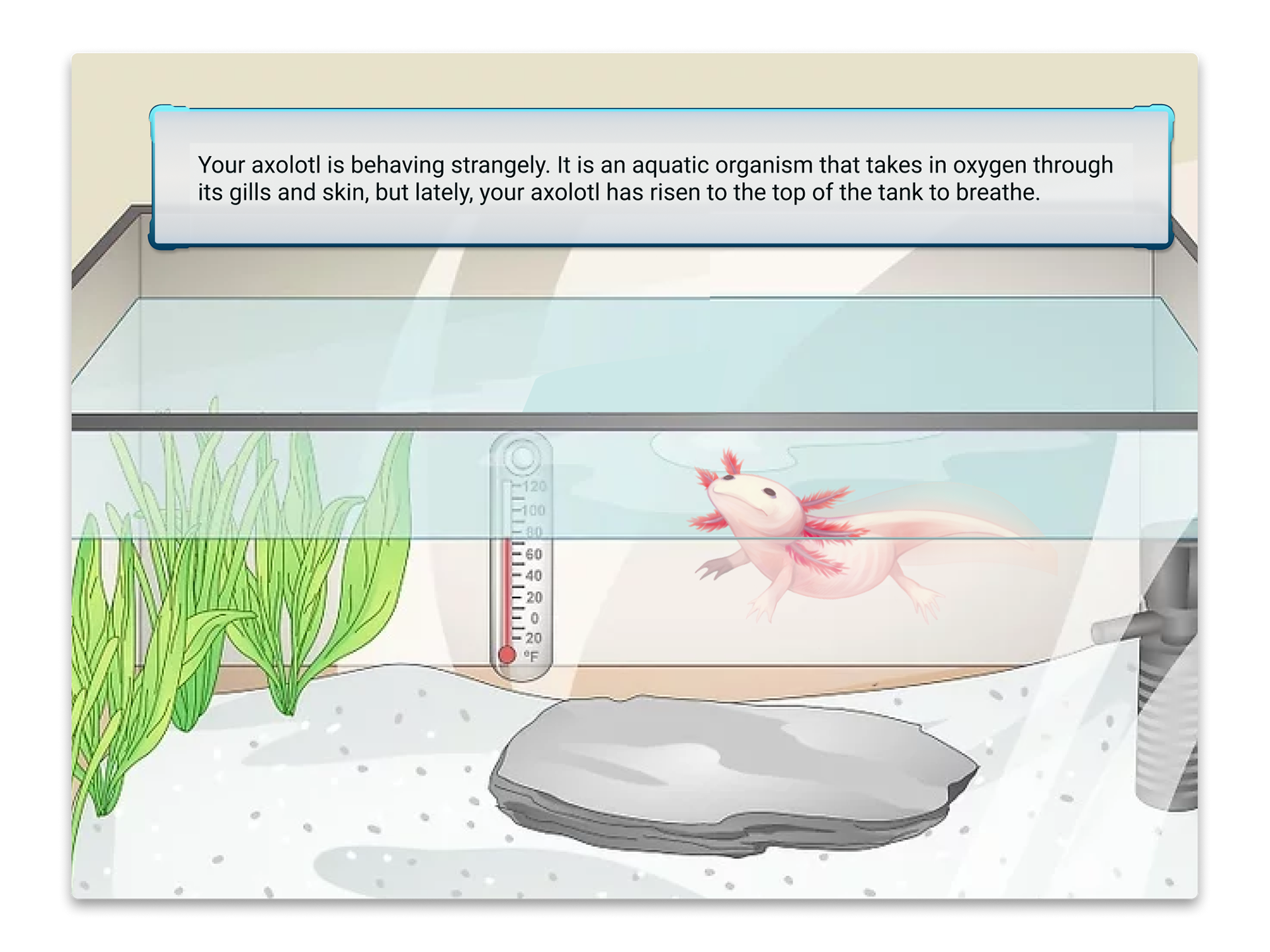
The Change: I worked with the PM to completely rewrite the problem scenario with visual context. We added an opening illustration of the axolotl scenario before entering the modeling space. We clarified instructions to focus on creating a solution: "Build a model showing how to help your axolotl breathe better underwater." We added specificity about which components mattered and tightened the language of individual components to leave less room for ambiguity. We also brought users back to the illustrated problem at the end to show their solution implemented.
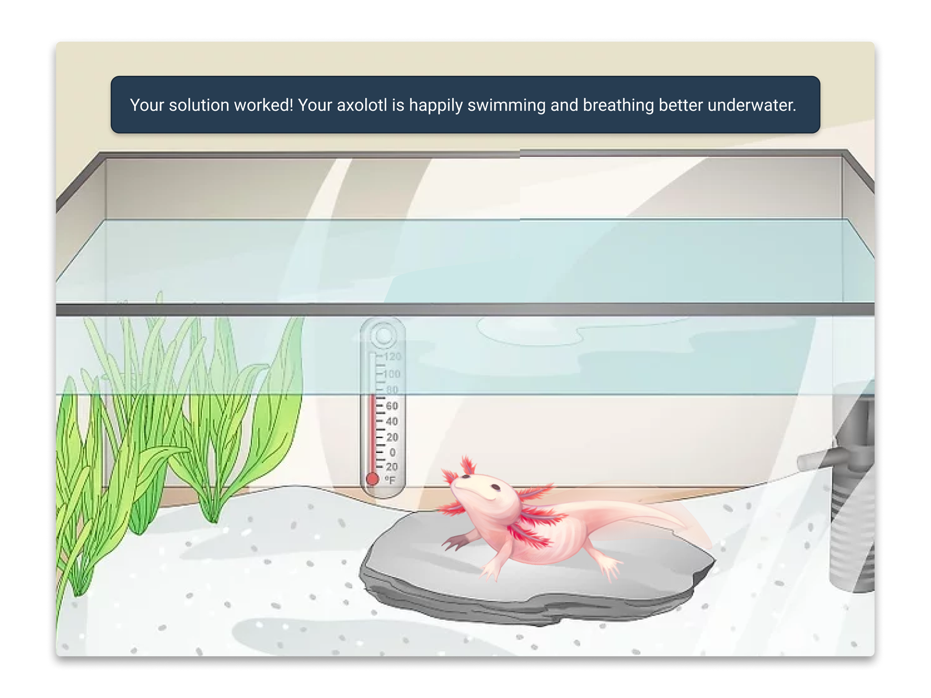
Validation: Teachers built focused, solution-oriented models without the ambiguity we saw in Round 1. The visual context and specific instructions eliminated conceptual wandering. Only one of the four Round 2 testers had questions about what "increasing" or "decreasing" meant, and even then, those questions didn't prevent them from building a solution-focused model. All testers felt more grounded in the problem and moved confidently through the complex modeling task.
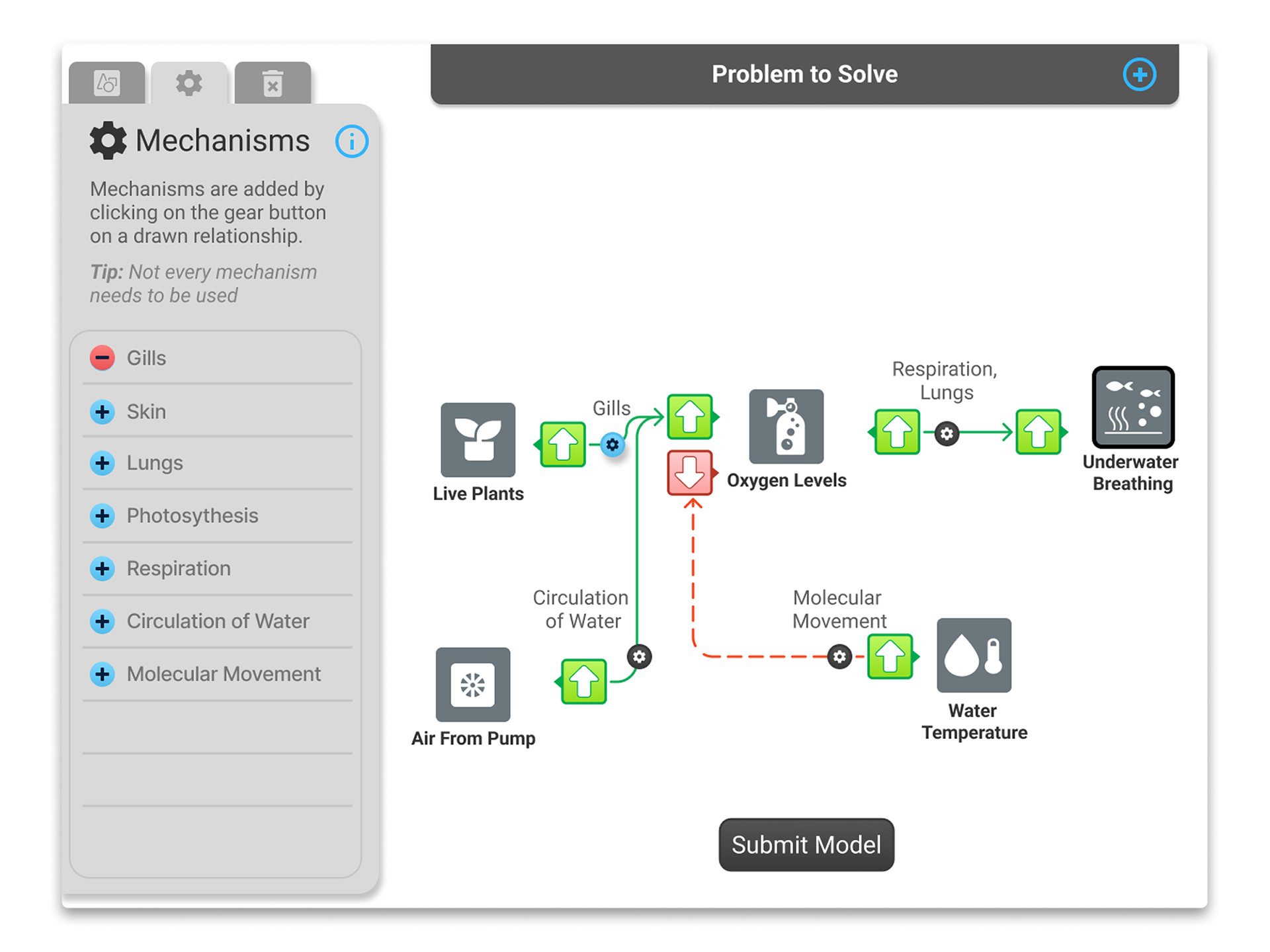
Problem 3: Mechanisms Interaction Flow
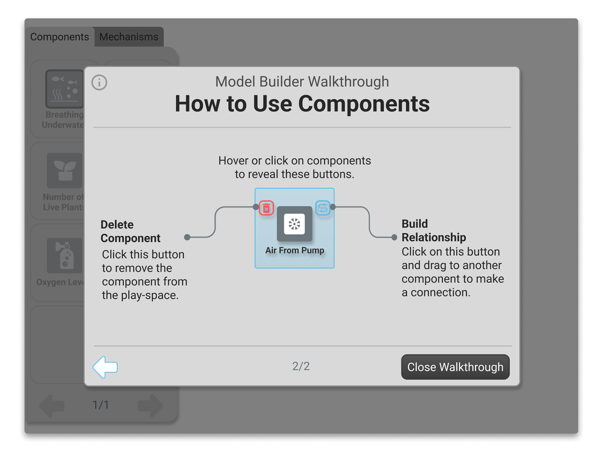
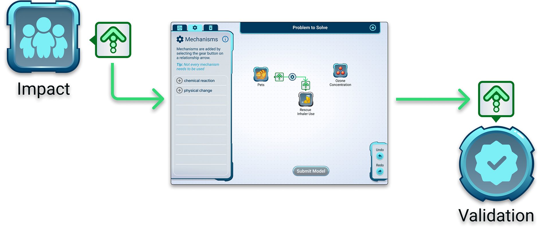
What failed: I designed a drag-and-drop interaction for adding mechanisms to relationship arrows. Users clicked a "Mechanisms" tab to enter mechanism-adding mode, which revealed drop zones over each arrow. They'd drag mechanisms from the mechanism inventory tab and drop them onto arrows. But testers found this confusing. More importantly, the design only allowed one mechanism per arrow, but multiple testers wanted to add multiple mechanisms to better describe their models (for example, showing both photosynthesis and molecular movement affecting oxygen levels).
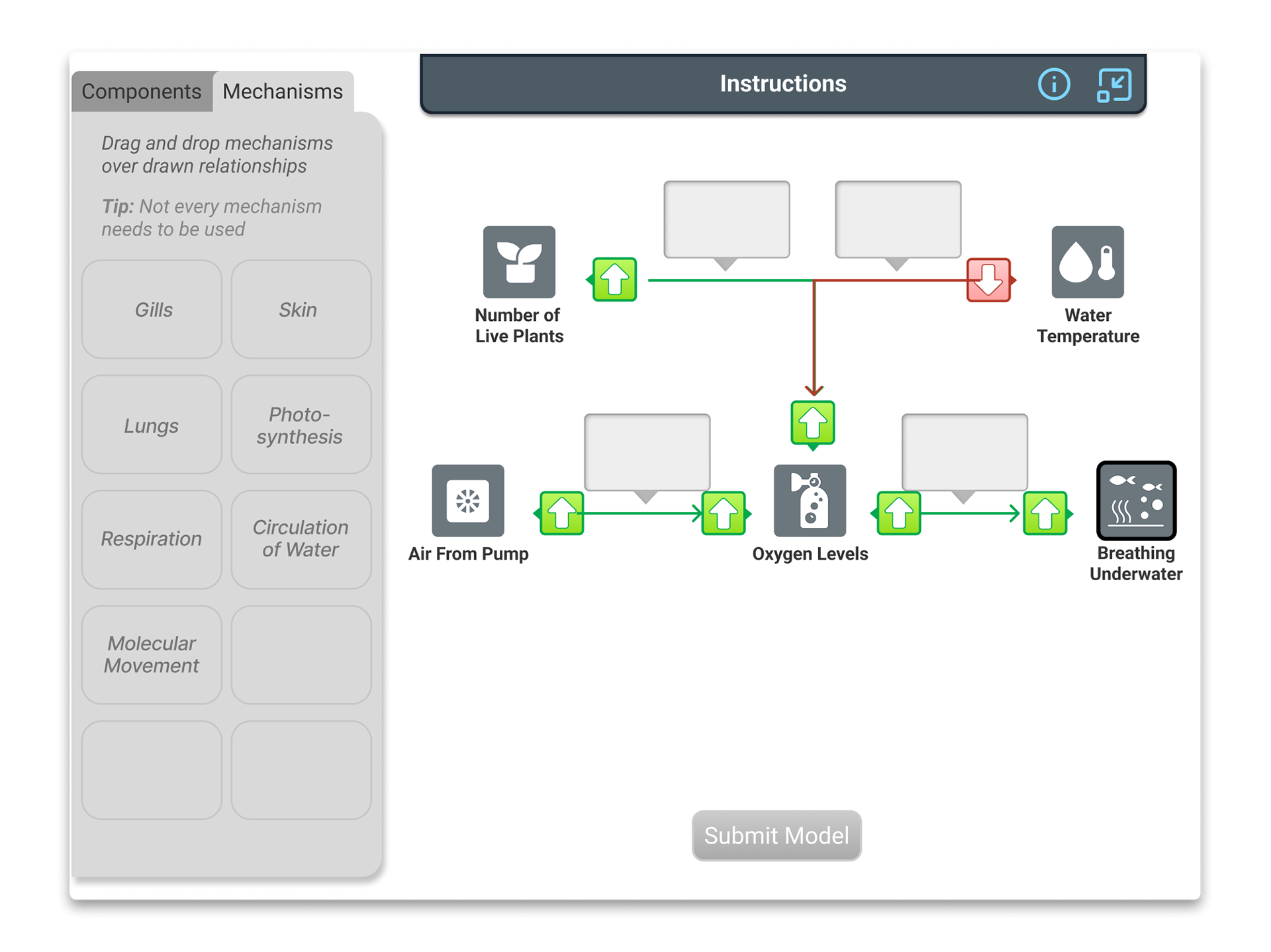
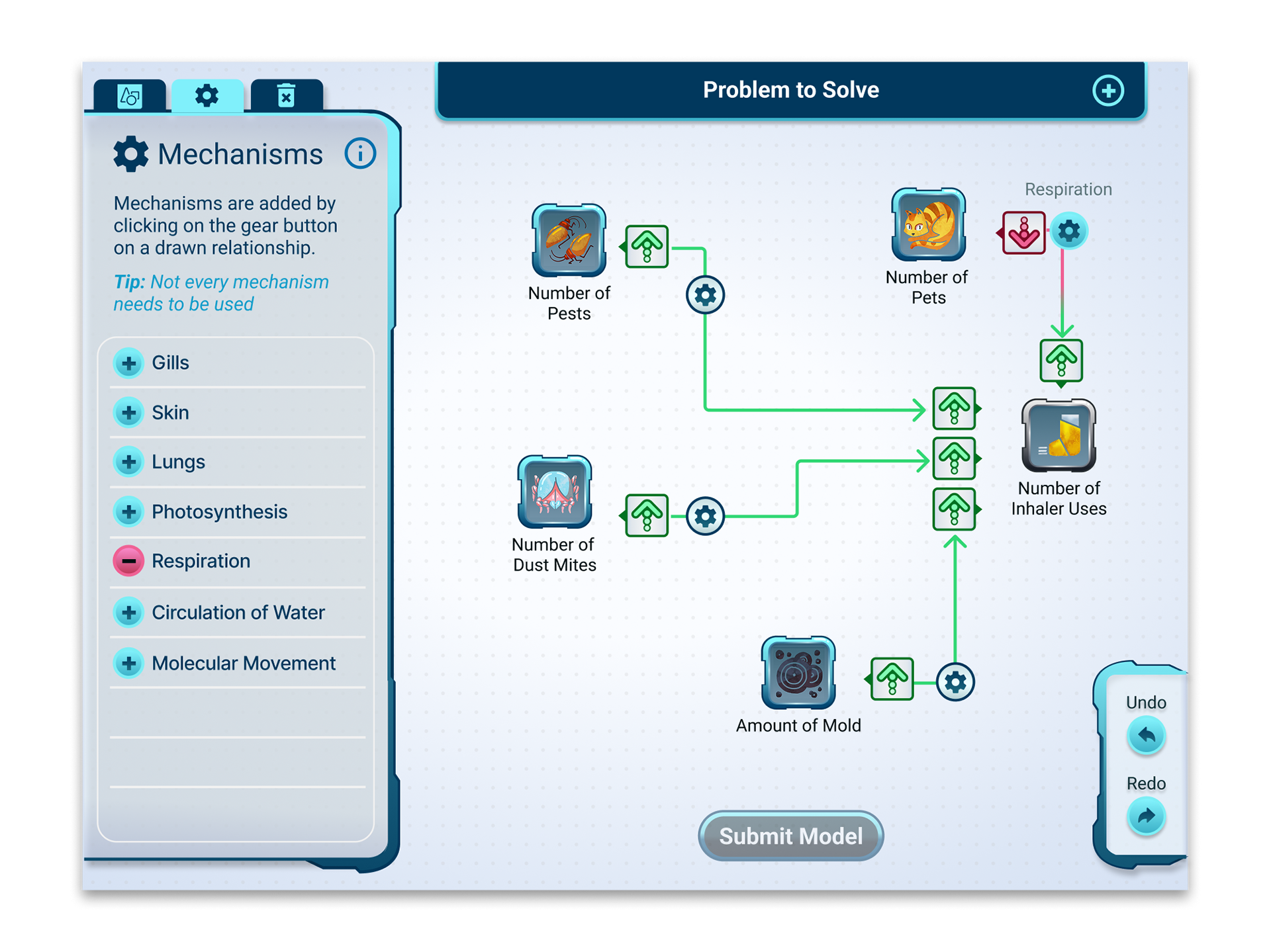
The Change: I replaced drag-and-drop with a click-based interaction. When users opened the Mechanisms tab, gear button icons appeared over each relationship arrow (matching the gear icon in the mechanisms tab). Clicking a gear revealed a green plus button by each mechanism in the mechanism list. As well as red minus buttons to remove them once added to a selected relationship. This interaction change simplified the visual design. Instead of prominent drop zones taking up space and visual weight, mechanisms appeared as simple text labels above arrows. This freed up room in the modeling space for multiple mechanisms per arrow.
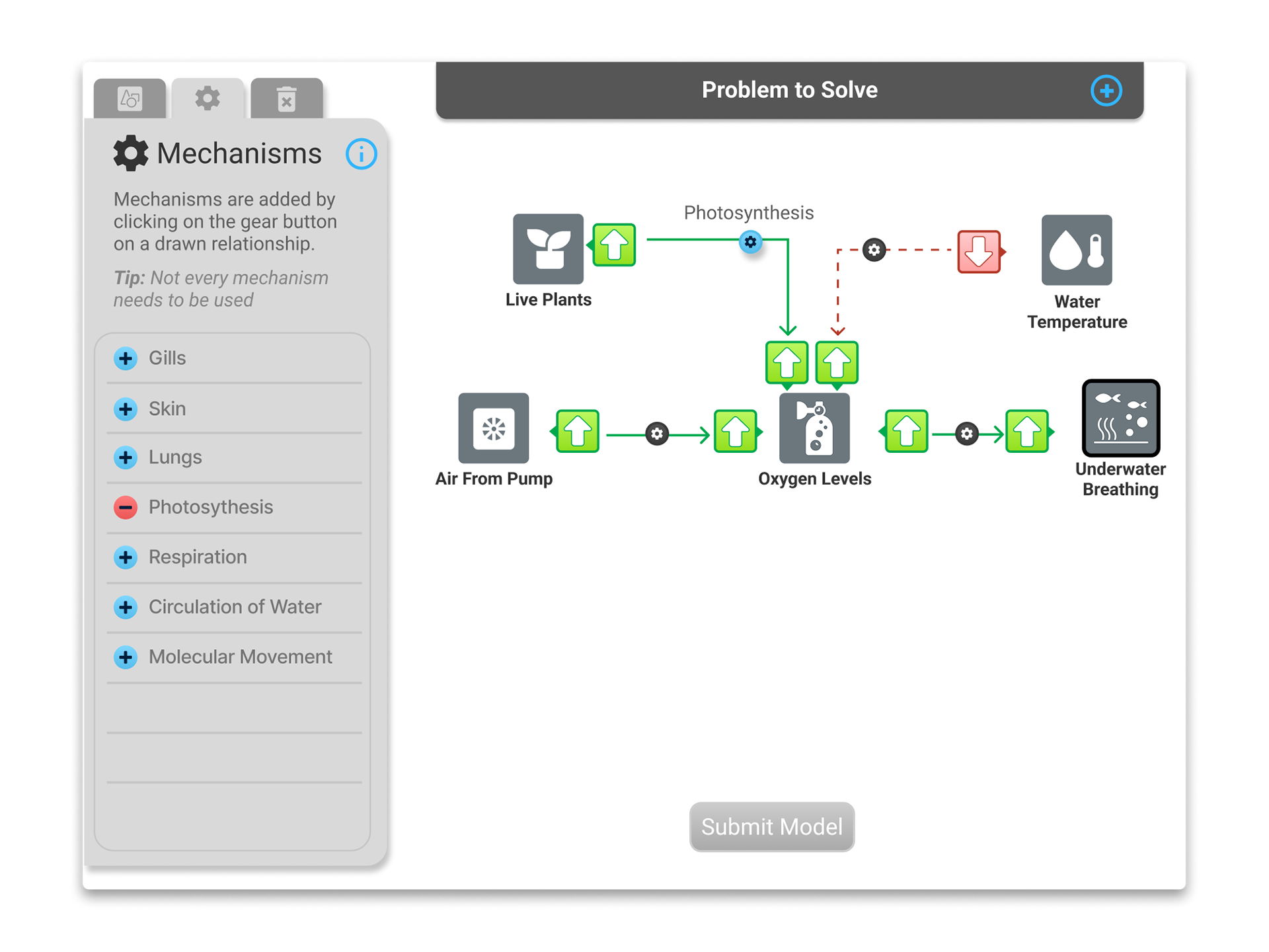
Validation: The click-based interaction proved to be significantly more intuitive. Teachers understood the gear buttons immediately and appreciated the added level of detail that multiple mechanisms provided. Some even requested a write-in option for advanced students to create custom mechanisms. We took this as a sign that the feature had gone from confusing to empowering.
Impact & Validation
The model builder launched in 4 STEM Cases spanning biology, environmental science, and chemistry, with a 5th case in development. Over 60,000 students used these cases in the 2024 school year alone. It became the foundational template for modeling interactions across our product line. Even simplified versions for middle school cases borrowed its core patterns.
Behavioral evidence: Teachers reported that students who used the model builder demonstrated clearer cause-and-effect reasoning in their written explanations compared to students who only answered text-based questions. The tool helped students show their thinking visually before articulating it verbally.
Strategic impact: Our Science Director championed the model builder internally because it helped teachers meet state engineering education standards. Modeling is explicitly required in those standards but often skipped due to lack of accessible tools. By making modeling both teachable and gradable, we gave teachers a practical way to meet these requirements.
Reflection & Learnings

Research methods should match the problem's openness. Traditional prototyping tools assume you know what users will do. But modeling is inherently open-ended. Users can build infinite variations. The Wizard of Oz method let me test conceptual understanding without constraining users to pre-built paths. I learned that when you're designing for creative, exploratory tasks, your research method needs to be just as flexible as the tool you're building.

Scaffolding is teaching, not hand-holding. I initially worried that an interactive tutorial would feel restrictive or slow. But I learned that in educational tools, constraints aren't limitations; they can be teaching moments. The step-by-step tutorial didn't limit users; it gave them a mental model they could apply to complex problems. Good scaffolding builds confidence, and confident users take more creative risks. Round 2 teachers moved faster and built more sophisticated models precisely because the tutorial gave them a foundation to build on.

Partnership with domain experts is non-negotiable. My PM's pedagogical expertise brought insights to this project I never would have thought up (if-then statements mirroring classroom language, mechanisms describing component relationships), and my design expertise translated her teaching knowledge into interaction patterns. Design in complex domains requires humility about what you don't know and the ability to translate expert knowledge into interaction patterns. True collaboration means both people make the work better.
---> Thanks for reading! <---