STEM Case UI Redesign

Role
Lead UI Designer
Lead UI Designer

Process
1. Visual research
2. Black & white wireframes
3. Color exploration
4. Final design system
1. Visual research
2. Black & white wireframes
3. Color exploration
4. Final design system

Outcome
A cohesive, engaging interface that elevates the educational experience and matches the visual quality of illustrations and video content.
A cohesive, engaging interface that elevates the educational experience and matches the visual quality of illustrations and video content.
The Challenge
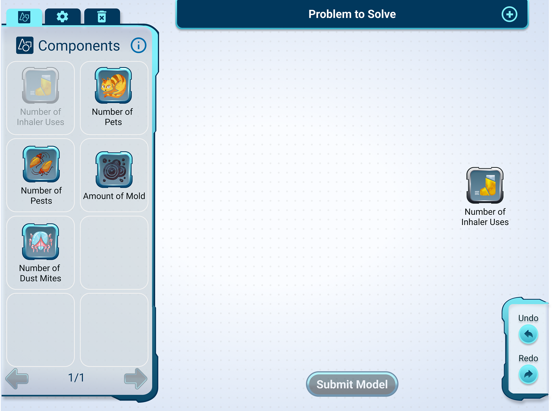
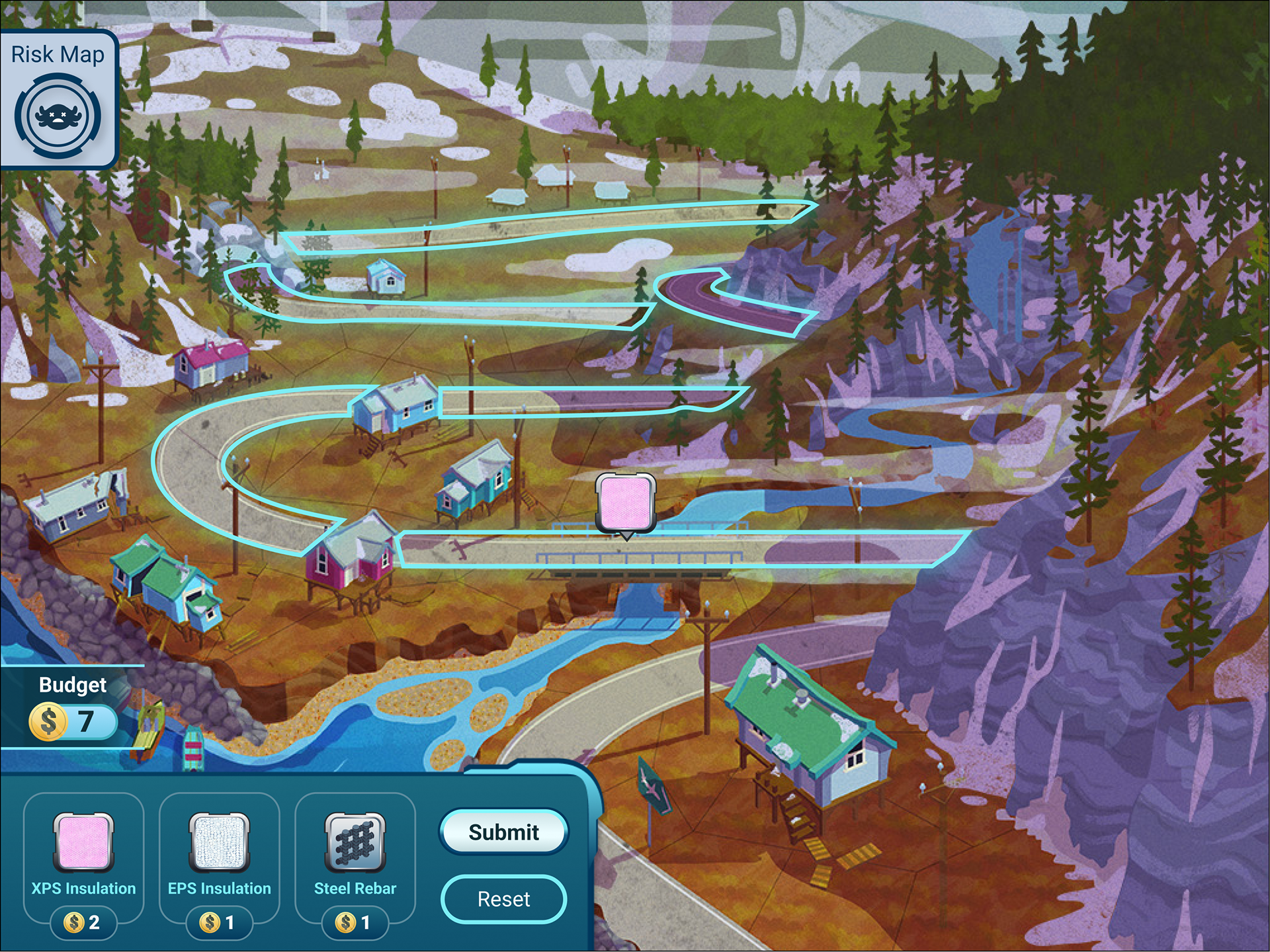
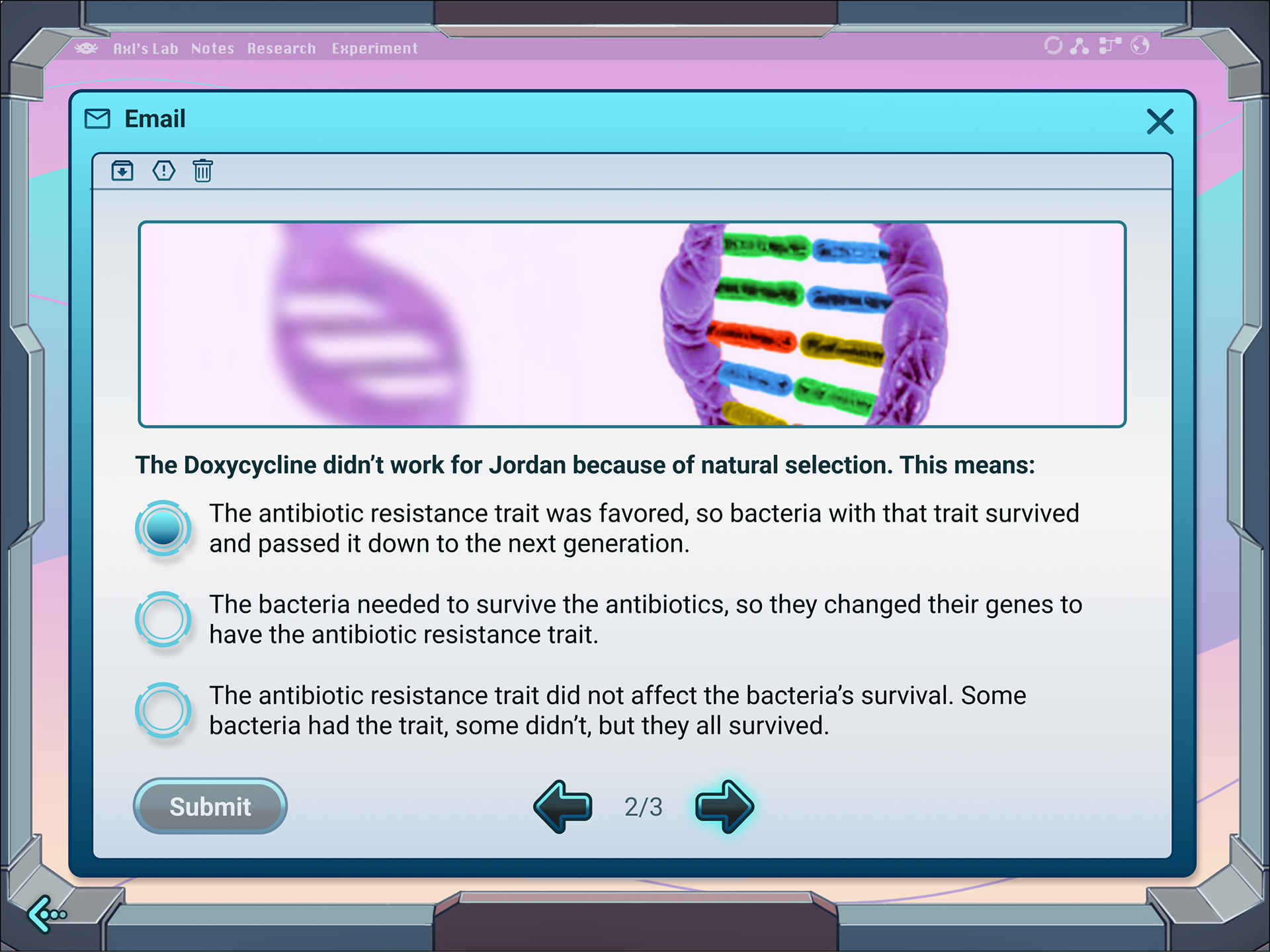
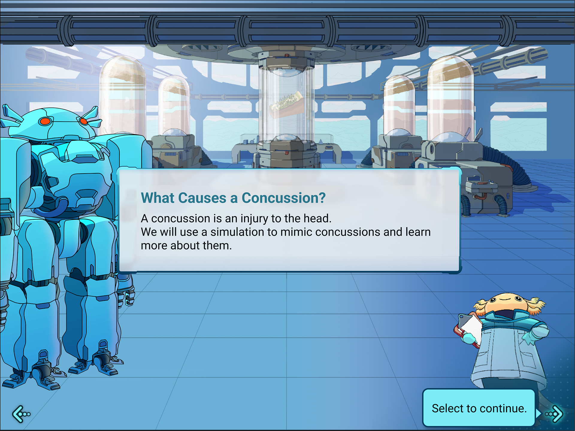
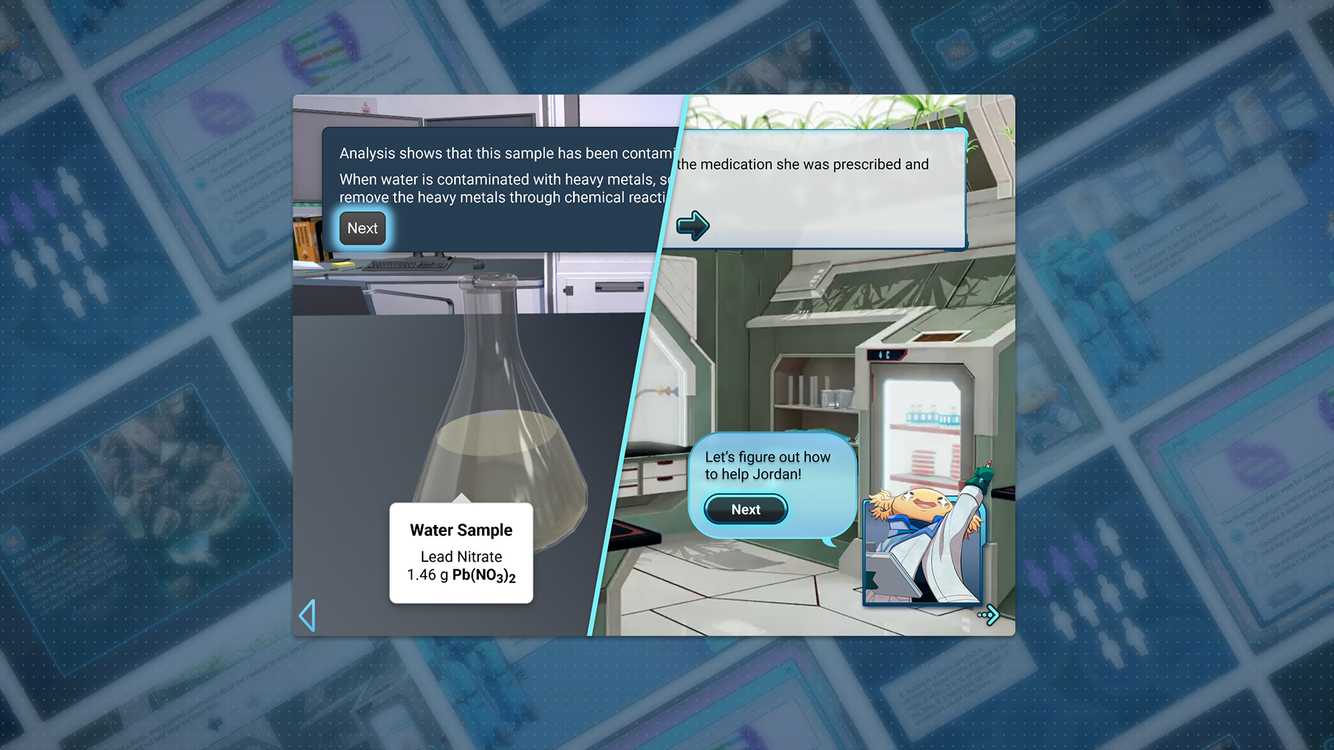
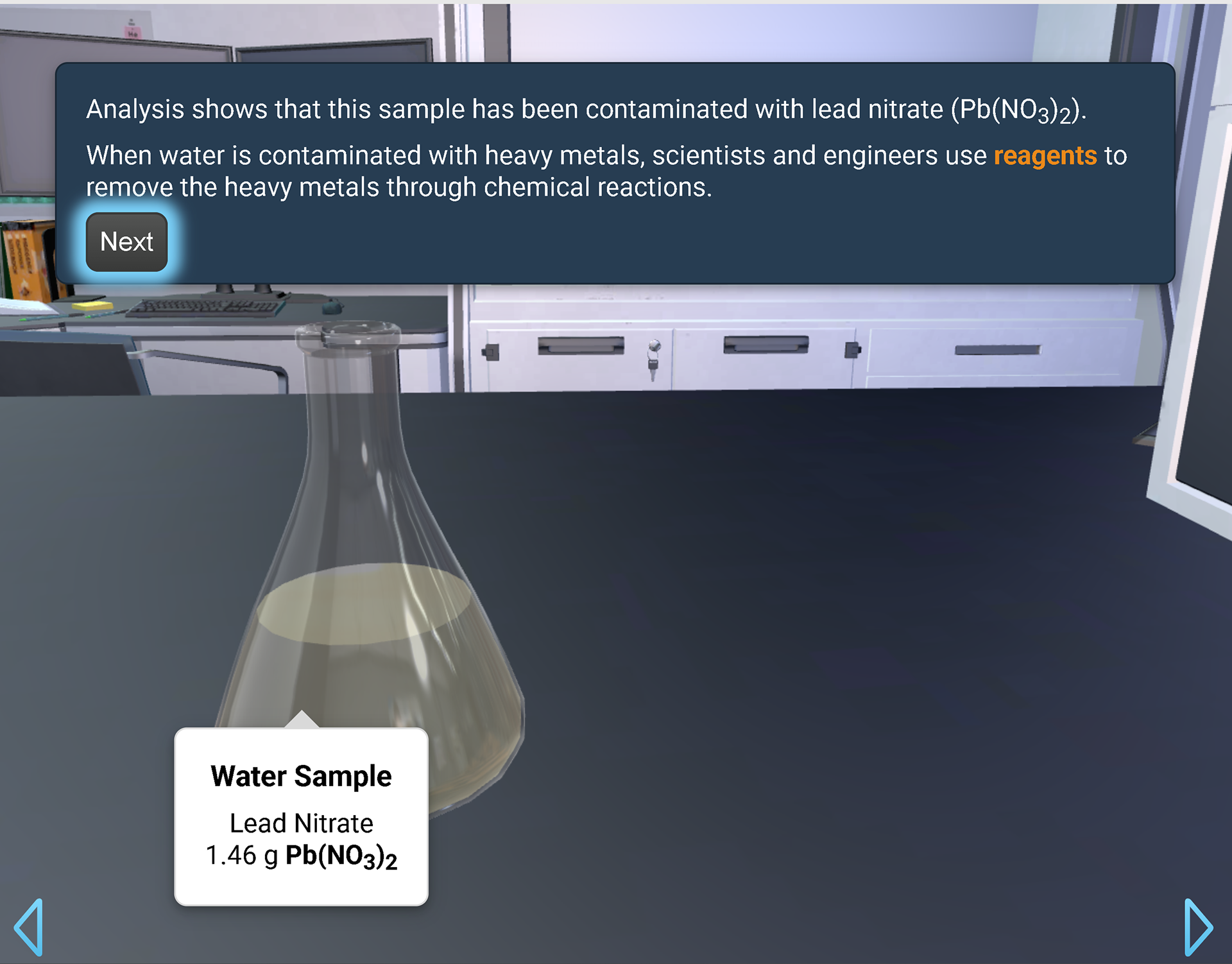
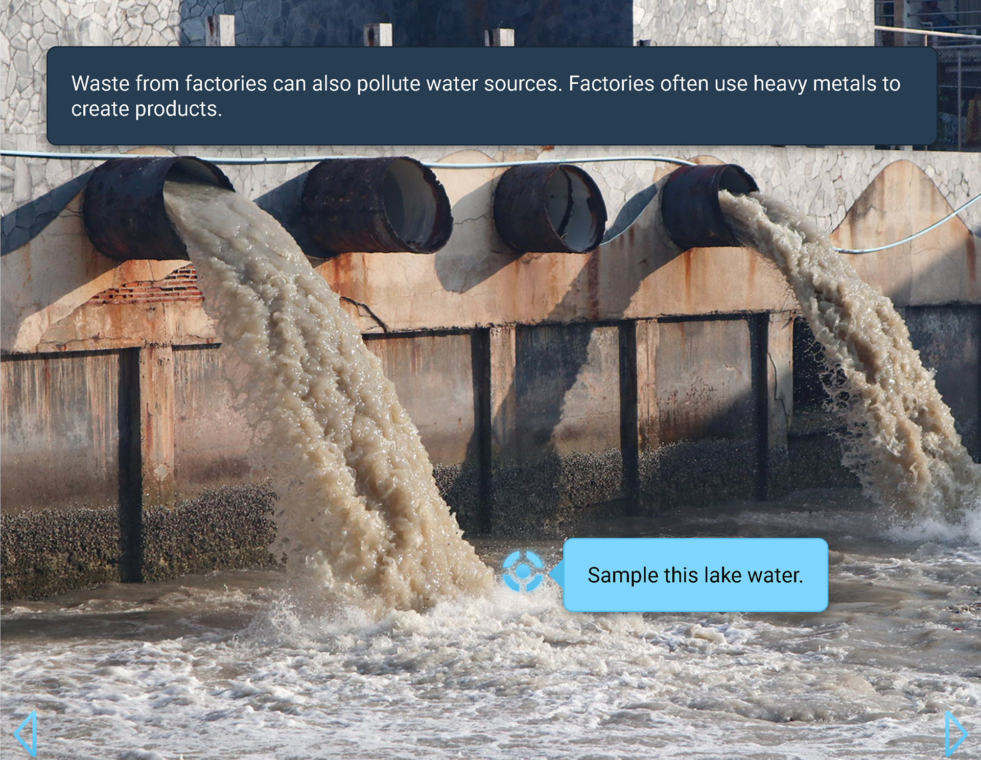
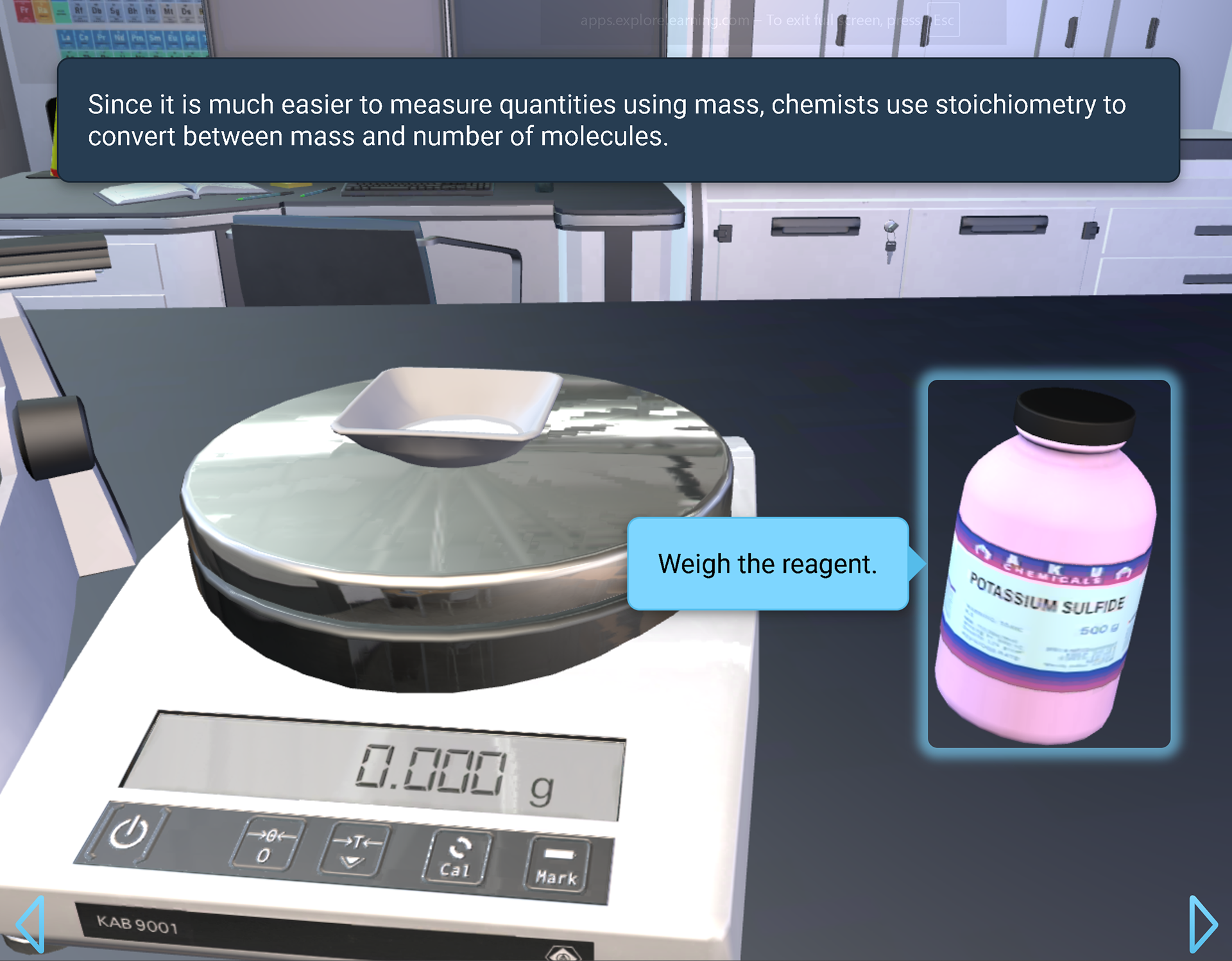
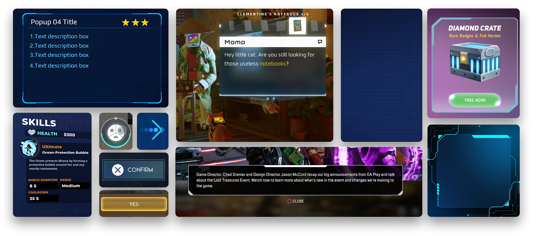
I redesigned the UI for an educational STEM platform where students (grades 6-12) take on the role of STEM professionals solving real-world problems. The original interface used basic, utilitarian styling that clashed with the platform's polished illustrations and video content. Typography lacked hierarchy, containers were visually flat, and the overall design felt generic and outdated. For a product meant to engage 12-18 year olds in active learning, the interface needed to match the quality and energy of the content itself.
Visual Exploration
As part of visual research, I gathered inspiration from video game UI to find a visual language that could engage students while maintaining educational credibility.
I developed four distinct style directions to pitch to the art director based on this research:
Glassmorphism: Vibrant, Clean, Airy
Translucent layers with gradient borders and blur effects.
Organic Minimalism: Organic, Simple, Friendly
Imperfect rounded rectangles and soft shapes with flat colors.
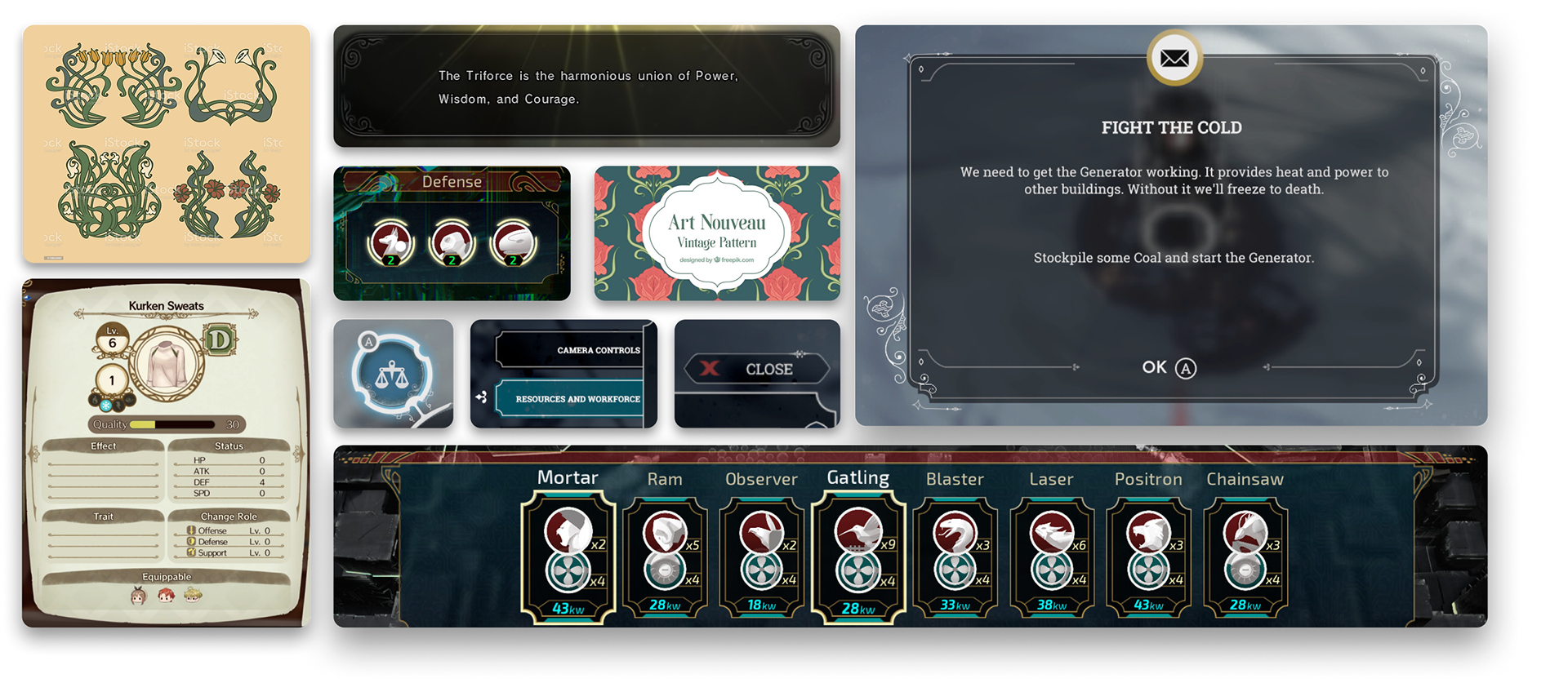
Simplistic Art Nouveau: Ornate, Fresh, Chic
Modernized whiplash lines and decorative flourishes.
Bright Sci-Fi: Cool, Clean, Structured
Cool-toned palettes with geometric patterns and glowing edges.
Working with my creative director, we selected a refined version of Bright Sci-Fi. I agreed with this choice as it balanced technical credibility with student engagement through saturated color and restrained geometric patterns.
DESIGN EVOLUTIOn
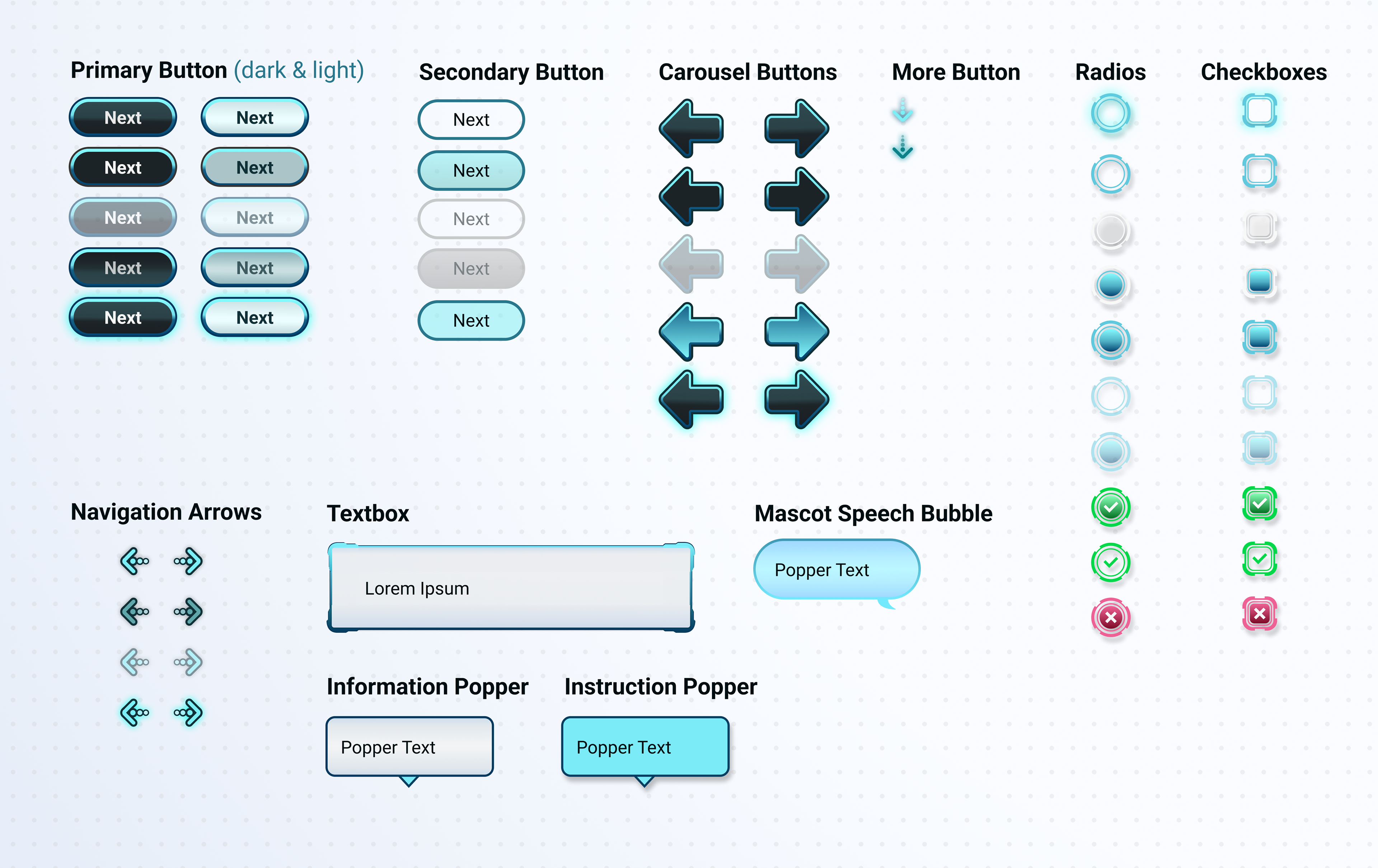
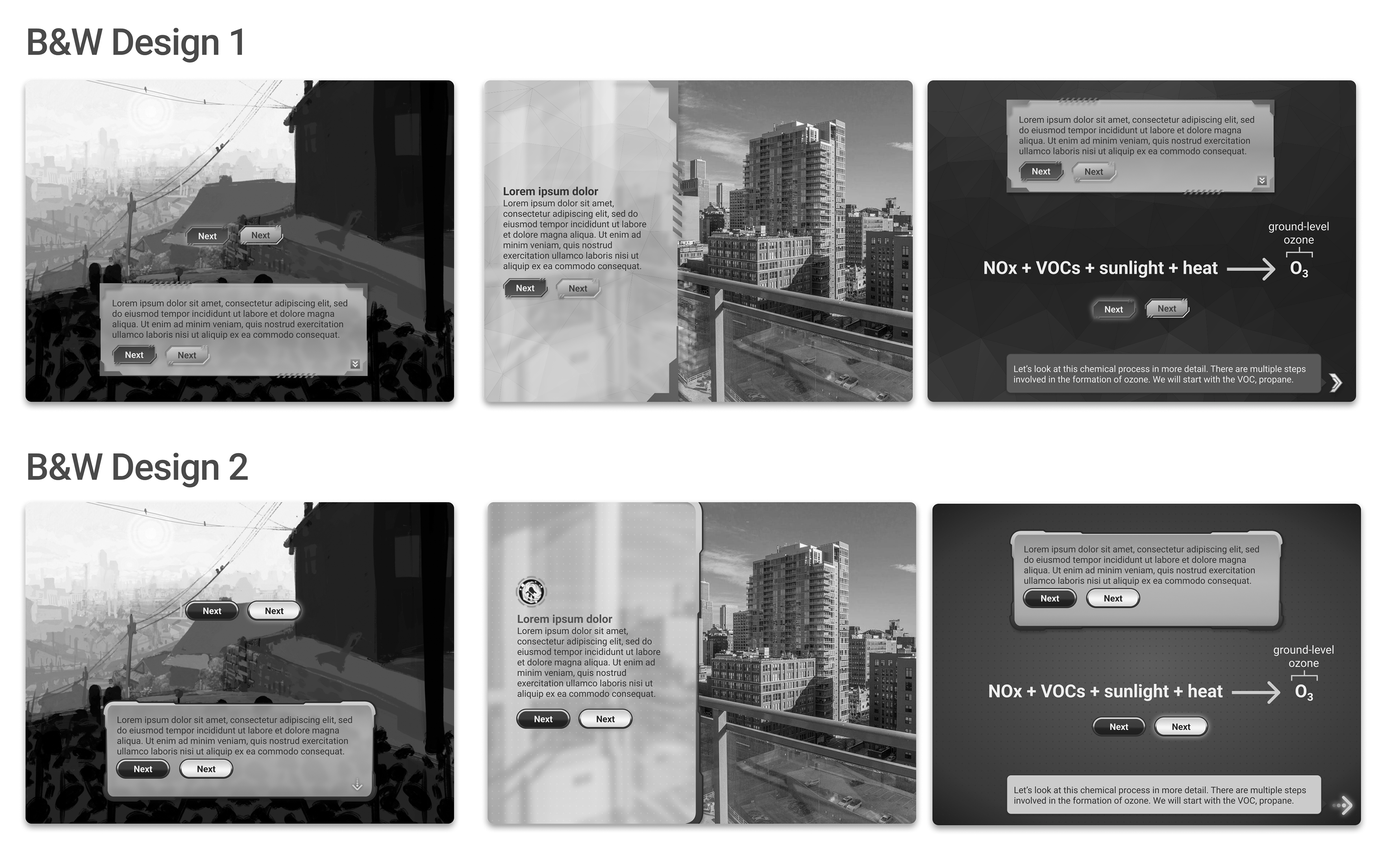
Shape Language in Black and White
I began in black and white to establish hierarchy, spacing, and content structure without color influence. I focused on the most-used elements: textboxes, instruction poppers, buttons, and backgrounds. Two variations explored the "Bright Sci-Fi" style: sharp rectangular corners with diagonal line motifs versus rounded corners with tiered borders. The rounded approach won for its friendlier feel, better supporting approachable science education.
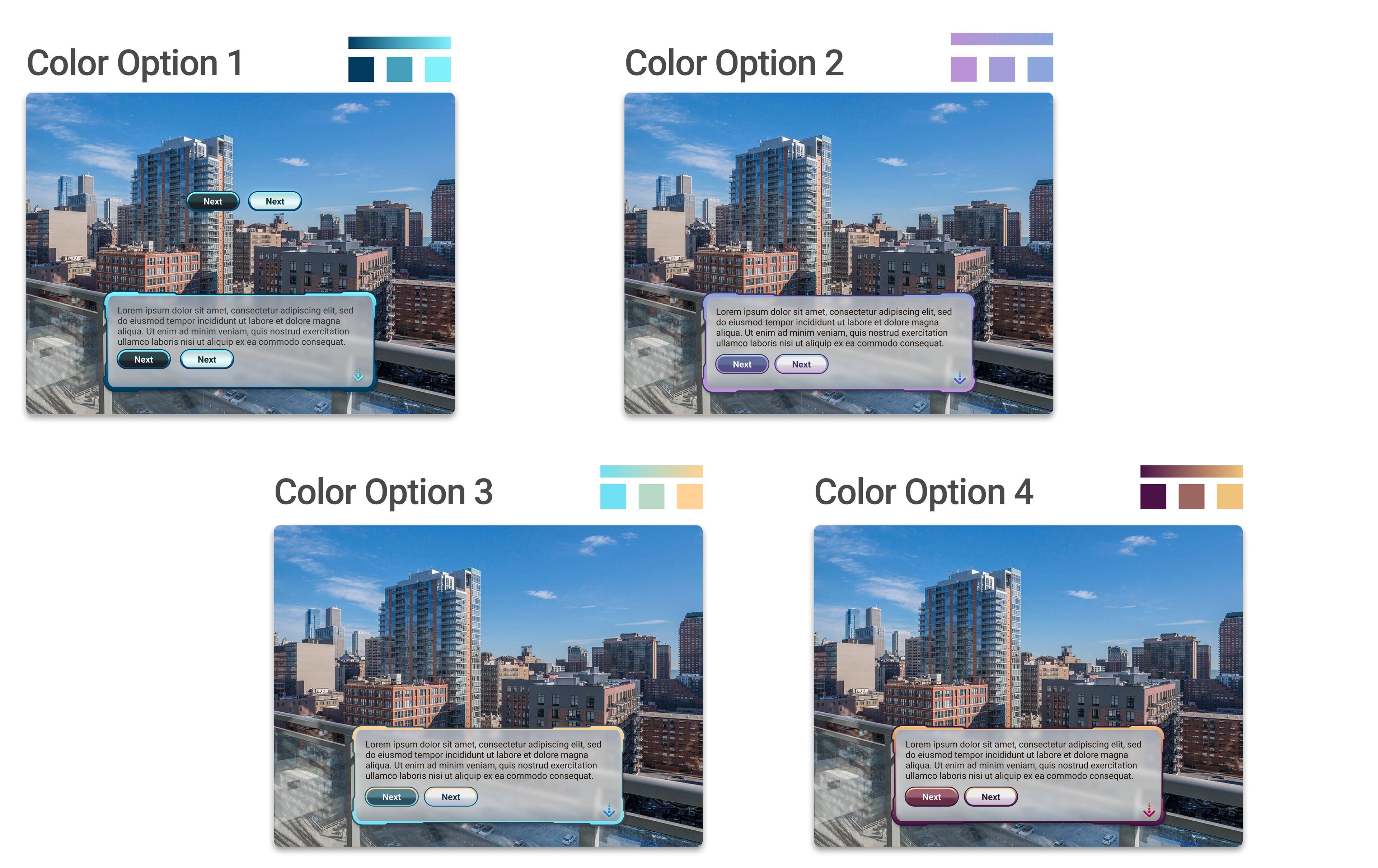
Color Exploration
I tested four distinct palettes: cool blues and teals, purple-lavender schemes, warm cyan-to-peach gradients, and rich purple-to-peach transitions. The teal palette was selected for balancing scientific credibility with approachability. Gradients added depth without feeling sterile, while high saturation maintained engagement for ages 12-18. Testing against concept art and photography confirmed it worked across varied backgrounds and felt contemporary without being overly playful.
Final Refinement
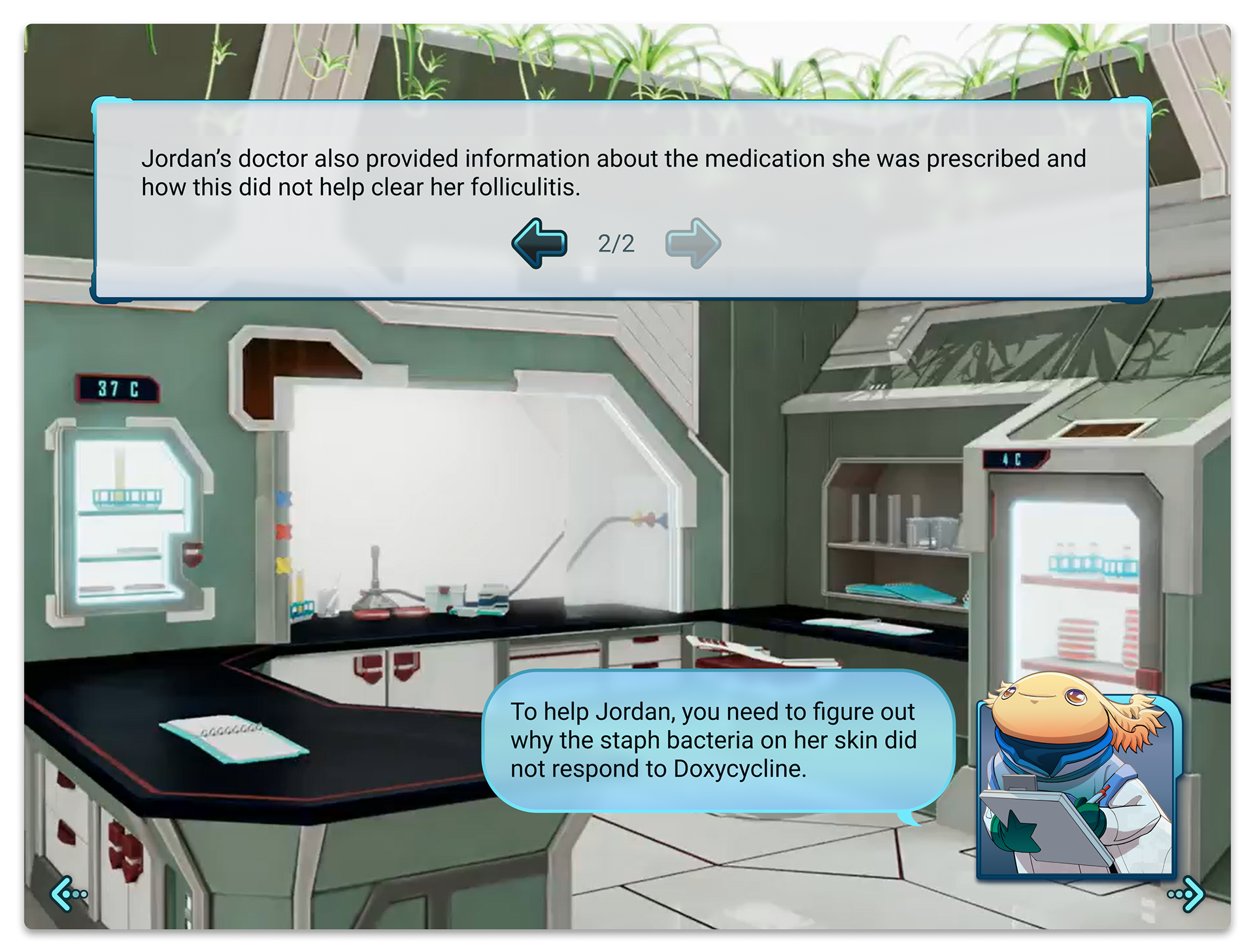
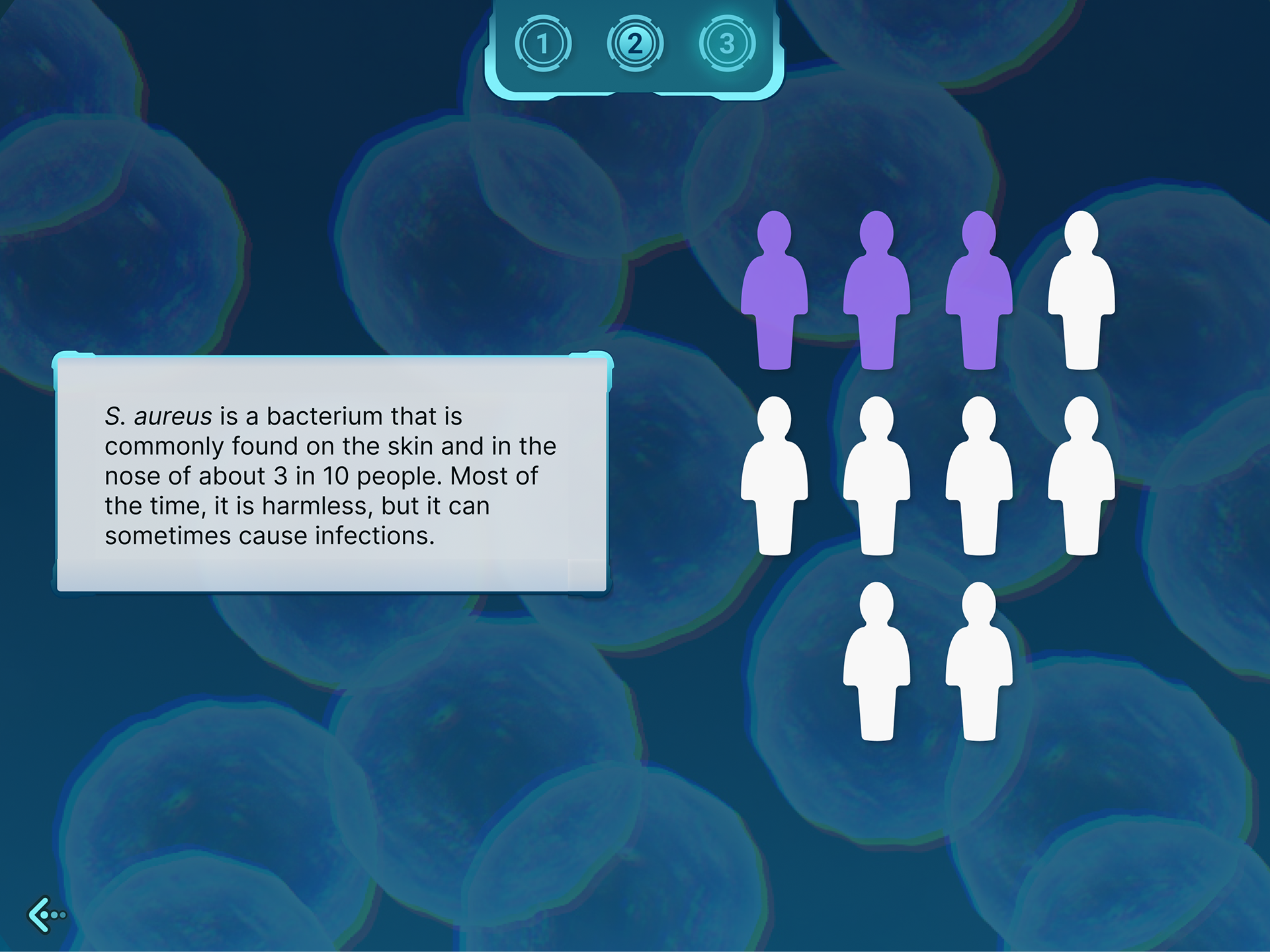
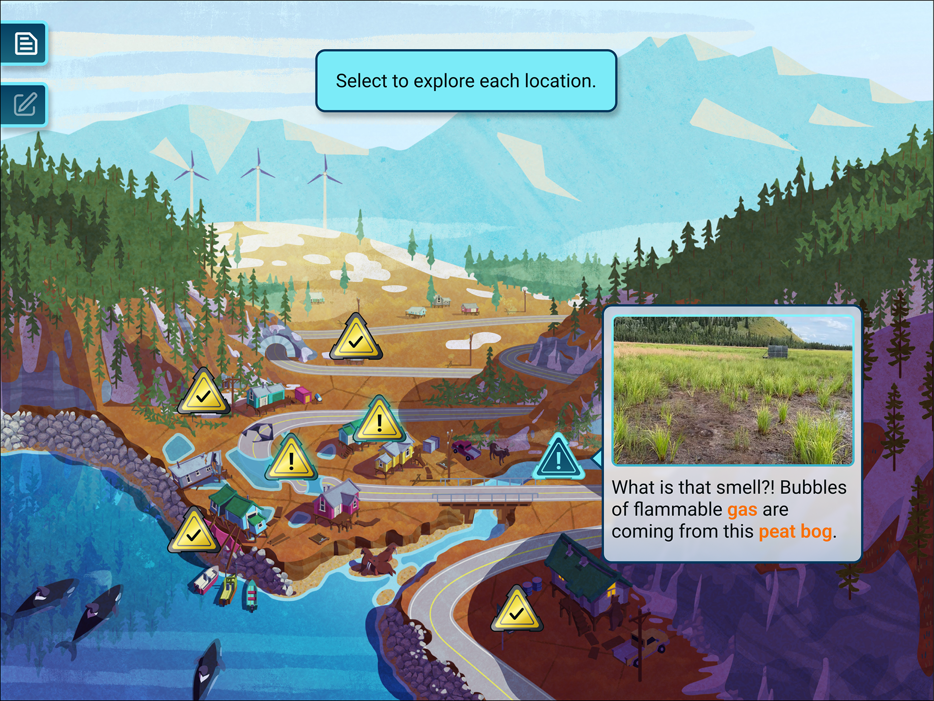
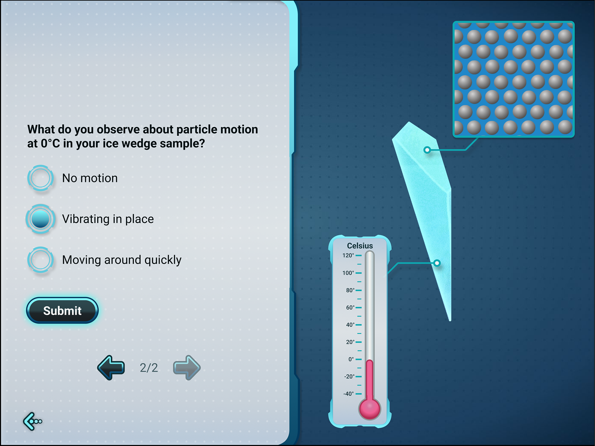
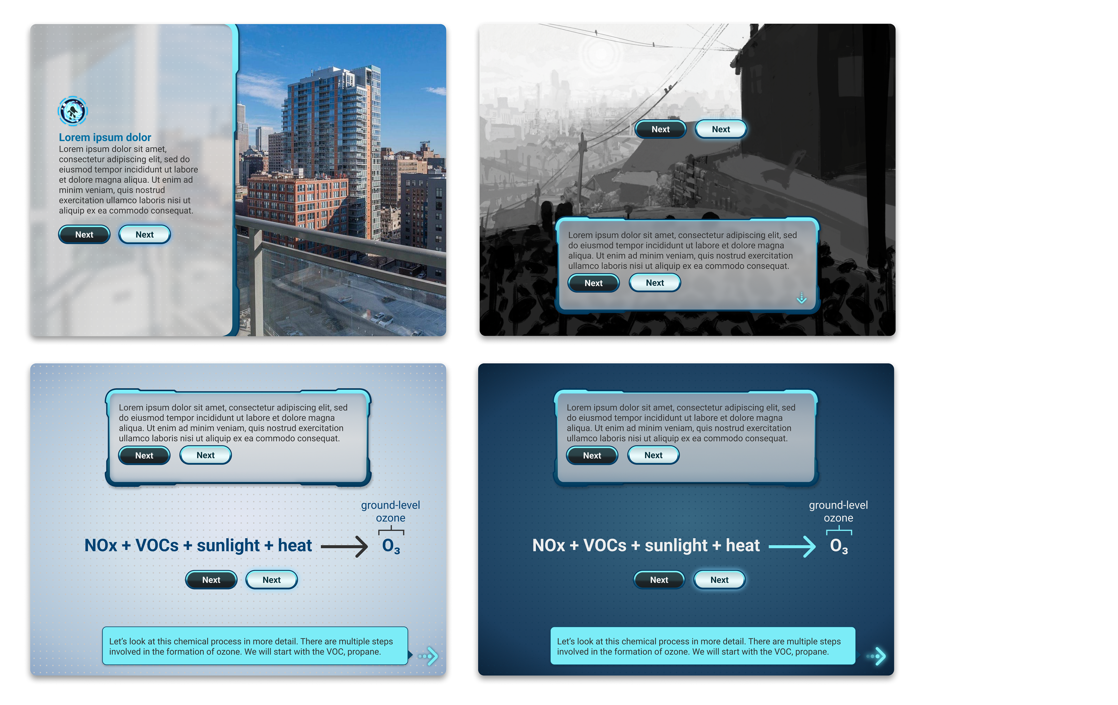
Final refinement focused on textbox borders, button contrast, and ensuring the system worked across diverse content types: illustrated backgrounds, photography overlays, data visualizations, and interactive elements.
Final refinement focused on textbox borders, button contrast, and ensuring the system worked across diverse content types: illustrated backgrounds, photography overlays, data visualizations, and interactive elements.
DESIGN SYSTEM FOUNDATIONS
The color palette centered on teal and cyan blues, evoking both scientific precision and contemporary digital experiences familiar to students. The gradient from darker to lighter teal adds visual interest without overwhelming educational content.
Shape language motif in the final design used tiered borders with diagonal cut-ins to play to the sci-fi feel, while the rounded corners of the edges of textboxes and poppers kept all shapes feeling friendly.
Geometric patterns making up the neutral background design consist of repeated dots in a grid played toward the sci-fi aesthetic of structure. This design, being made of small circles, also helped it feel approachable and not rigid, as the other geometric pattern did.